4 Mobile App Design Pattern Every Designer Would Love to Use
Probably the two biggest mission-critical elements for designing a mobile app are the usefulness and intuitiveness of the design. The app must be useful; otherwise it would be of no use. If the app is even a steep learning curve for people to use it won’t make a difference. All major mobile UI design trends have consistent focus on these two aspects. By making use of UI Design Patterns, the designer can solve common problems and make the design work to ensure usefulness and intuitive aspect.
Mobile app design patterns have now been matured enough to address all the crucial aspects that users face while using an app. Design patterns actually prevent users from making common design mistakes and provide solutions to design challenges that are frequent. From the invitation patterns to content based navigation patterns to the ones for intuitive patterns like sliders or slide-outs, design patterns can add immense value to the design and development and end user experience. Here below we introduce 4 mobile app design patterns to make any app useful and intuitive.
1. Invitation and coaching
Usefulness or letting users find a solution to one of their problems is the invincible element of a successful app. But, sometimes while making an app useful by incorporating an array of tools and contents one can actually end up developing it complicated enough for the end user. To address this problem providing an invitation guide or tutorial or demo demonstrating how it works, can be highly effective. There is an array of useful patterns to address this issue, all working to simplify user experience and complexity of the app in their own way.
Can you recall using the Photoshop app for the first time? Obviously, almost all of us after opening the app got a blank canvas and a range of tools on both sides. Although, the app seemed useful it was devoid of any clue of how to make use of it. Since then almost a decade passed and now there are thousands of apps providing the same usefulness but with the positive difference of guiding the user as how to use it. Providing guidance as what to do with an app and how to use an app is crucial for the success of an app. In various ways this can be done. Let us a have a look at some of them here below.
Dialog
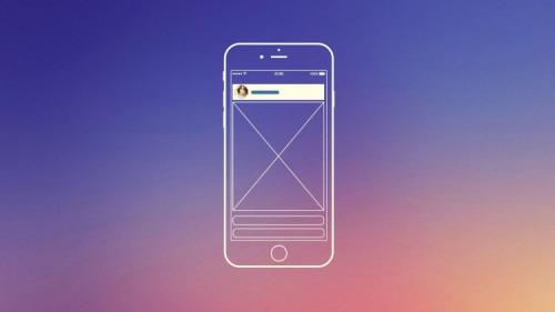
A dialog containing simple instructions for guiding the user is the most common and useful design pattern. Despite its usefulness this pattern is also get dismissed and ignored by the user more frequently. Always make the dialog content crisp, short and easily readable on the screen. As it is ignored quite often always provide alternate way to access instructions just within the app menu.
Tip
A tip is more intuitive kind of guidance as it appears when users need it most just in the context of an action. Tip is more contextually relevant than so called dialog contents. A small text appearing in many ecommerce app telling ‘save your search’ or ‘go to kart’ is good examples of tip. Provide tip close to the feature related to it and use it contextually after the interaction. Make sure the ‘tip’ content is small and directly intuitive.
Tour
A tour is the tool with broadest scope of orienting a user and guiding him upon reaching the app screen. By exploring the entire app at a screen-by-screen basis providing guidance on every feature and content page, it leaves no possibility unturned as far as the driving usefulness is concerned. The tour can further be value added with new device technologies. GPS tour is a great example of such pattern. Concise copy, bright and detailed graphics, simple and user friendly navigation and easy options of exit make this kind of invitation pattern more intuitive and useful. A tour pattern should be visually engaging and should focus on offering an idea about the key features from the perspective of the user.
Video Demo
Apps that rely more on actions or user interactions, can find video demo as the best invitation pattern to guide users. Video demo should be short, engaging and should focus on the key features and actionable elements from the user perspective. A demo video should also offer all regular user controls for any video like volume control, stop, pause, etc.
2. Content-Based Navigation
Irrespective of the type of content incorporated in the design of an app, offering a fluid flow of content is crucial for an easy navigation helping users the contents they need. Content based navigation used as a popular app design pattern to help transitions between app overview and details seamlessly in a fluid manner. For instance double tap on an image can let you see the detailed view of a profile with facts and information, while the overall gross view of listed profiles is always there.
3. Pop-up window
Though for years the use of popped-in
windows has been subject of considerable antipathy as users have been used to
see advertisements appearing on them causing distraction in their web browsing
or app use. But with the evolution of mobile apps now sometimes even notifications
carrying additional data can add value to the user experience. This becomes
particularly useful when users are likely to show interest in something while
remaining in the middle of something. This let users interact with the app
better is the popped-in window is used more contextually.
- Pop-up let the user perform a certain task or get specific information useful for the context of his use without needing him to leave the app page he is busy with.
- Pop-up window can guide user concerning a mistake or requirement when filling a form or making a transaction. Such window can also be used to offer similar products while purchasing something in a web store.
- The main benefit of this pattern is that user never loses view of the original content or app area he was busy with. On the other hand it can add value to the user actions contextually.
- The pop-up should be short, absolutely contextual and understandable at a glance.
4. Slider, slide-outs, sidebars, & drawers
Slider as it denotes let the user slide pages enabling him to compare among products, locations, peoples and other things served by the app. A good example is the Uber app in which you can browse between four different types of ride services just by sliding the screen sideways. This allows users easy transition from one type of ride to other without opening separate screens.
As compared to other computing devices like desktops and laptops, mobile phones offer relatively much smaller screens. This makes navigation often challenging from one part of the app to other. Fitting all the contents, features and buttons on a small UI to allow easy access and transition from one app element to other is the main design challenge. Some handy and useful patterns like slide-outs, sidebars and drawers can help delivering large chunk of information and feature set on the single screen of mobile device.
Post Your Ad Here
Comments