The Difference Between a Menu That Looks Good and One That Works Every Night

Why Restaurants Confuse Visual Appeal With Real Performance
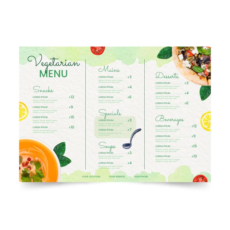
Menus are often redesigned because they feel dated, cluttered or visually uninspiring. Fonts are refreshed, colours refined, layouts simplified. When the new menu arrives, it usually looks better. Cleaner. More modern. More aligned with the brand.
What many restaurant owners discover later is that looking better does not automatically mean working better.
A menu that works every night is not judged by how it photographs or how it appears in a quiet room. It is judged by how it performs under pressure. During busy service. Under mixed lighting. In the hands of distracted customers making decisions quickly. That difference is where most menu redesigns quietly fail.
Menus Are Operational Tools, Not Design Pieces
The biggest mistake restaurants make is treating menus as design artefacts rather than operational tools. A visually pleasing menu solves branding concerns. A functional menu solves service problems.
During live service, customers are not admiring typography choices. They are scanning quickly, often while talking, often while staff are waiting nearby. They want reassurance, clarity and momentum. A menu that looks balanced but offers little guidance forces the customer to do more mental work than necessary.
Menus that work are designed around behaviour, not appearance. They anticipate how people actually read, not how designers hope they will read.
The Service Environment Changes Everything
Menus are rarely used in ideal conditions. Lighting varies across tables. Candles, warm bulbs and reflections alter contrast. Menus are tilted, shared, folded and sometimes read at arm’s length. Noise and conversation compete for attention.
Menu Designs that rely on subtle colour contrast, thin typefaces or tight spacing often perform well on screen but struggle in real dining rooms. What felt refined becomes difficult to read. What looked minimal becomes vague.
A menu that works every night is built with these realities in mind. It remains readable even when conditions are imperfect, which is most of the time.
Structure Outperforms Style During Decision Making
A good looking menu often distributes visual weight evenly. Everything feels calm and uniform. While this creates aesthetic harmony, it removes direction.
Customers do not want to analyse a menu. They want to be guided through it. Structure provides that guidance. Clear sections, predictable layouts and intentional spacing help customers move forward without hesitation.
Menus that work consistently do not rely on customers discovering items on their own. They quietly lead attention to where it matters most, without making the guidance feel forced.
Consistency Reduces Hesitation More Than Creativity
Creative layouts can feel engaging, but they often introduce unnecessary friction. When section styles change, layouts shift between pages, or spacing behaves unpredictably, customers slow down. They have to reorient themselves repeatedly.
During service, hesitation is costly. It delays ordering, increases questions and pushes customers toward safer choices.
Menus that perform night after night behave consistently from start to finish. Once a customer understands how one section works, the rest follow the same logic. That predictability creates confidence, and confident customers order more decisively.
Price Clarity Influences Comfort, Not Just Perception
Many menus that look good struggle with price handling. Prices are softened, reduced or placed inconsistently to maintain a premium feel. While visually pleasing, this often creates discomfort.
Customers still want to know what things cost. When prices are hard to locate, the brain fills the gap with uncertainty. That uncertainty does not always stop ordering, but it changes behaviour. Customers avoid premium items. Add ons feel riskier.
Menus that work present prices clearly without making them the focal point. They respect the customer’s need for certainty while keeping attention on choice rather than calculation.
Durability Is Part of Function, Not a Printing Detail
A menu’s performance does not end after printing. How it ages matters. Paper weight, finishes and folds affect how a menu feels after weeks of handling.
Menus that look excellent on day one can quickly lose credibility once corners curl, glare appears or text begins to fade. As physical quality drops, perceived food quality often follows.
Menus that work every night are designed and printed with longevity in mind. They feel intentional and reliable long after the initial rollout.
The Quiet Gap Between Looking Right and Working Right
The difference between menus that look good and menus that work is rarely obvious immediately. It appears over time. In smoother service. In fewer customer questions. In faster decisions. In higher average spend without overt selling.
Working menus are rarely praised. They are rarely noticed. They simply perform.
Restaurants that understand this stop redesigning menus for novelty and start designing them for reliability. They recognise that a menu’s job is not to impress, but to support decisions consistently, night after night.
That shift in thinking is why operators focused on real service conditions often partner with specialists like I YOU PRINT, who approach menu design and printing as an operational asset rather than a purely visual exercise.
Post Your Ad Here
Comments