Smart Ways to Add Bold Color Without Overwhelming Your Space
A bold color can transform a room from ordinary to unforgettable — if it’s used with thought. In Bellingham, where foggy mornings meet bright summer light, color behaves differently across seasons and rooms. This guide shows how to choose, place, and balance saturated hues so they read as confident and curated, not chaotic.
It’s written for homeowners and for residential painting contractors in Bellingham WA who want to deliver results-driven, user-friendly color solutions that feel both stylish and livable.
Why Bold Colors Work — and Why They Sometimes Fail
Bold colors create personality quickly: they bring warmth, drama, and focus. But a few common mistakes can turn an exciting paint choice into an exhausting one — painting an entire small room in a deep shade, ignoring lighting, or choosing the wrong finish.
The good news? These mistakes are avoidable with the right planning, lighting awareness, and paint application strategy.
Step 1: Start with the Light
Natural and artificial light dramatically change how color appears. North-facing rooms in Bellingham can look cooler and more muted because the light is softer; south- and west-facing rooms show warmer, more saturated tones.
Pro Tip: Hang 8½×11 paint swatches on the wall and observe them in morning, midday, and evening light. If the color reads too intense at midday, consider a slightly lighter or grayer version.
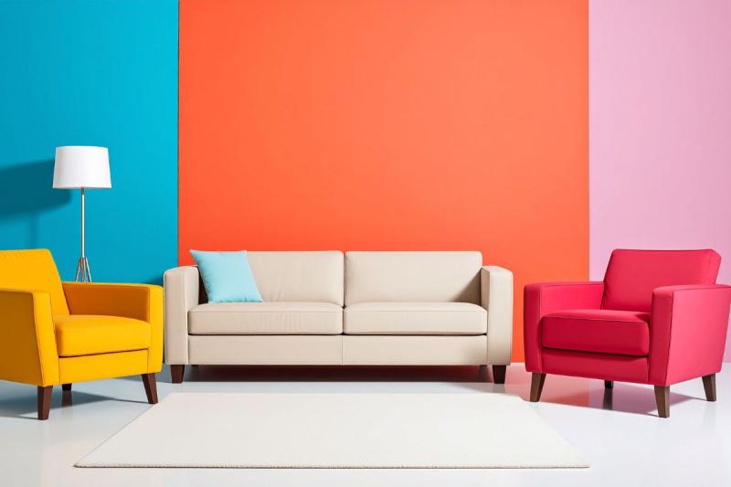
Step 2: Use Bold Colors as Accents
A bold color used on one wall, alcove, or ceiling feels intentional — not overwhelming. Accent applications let you deliver a “wow” moment while keeping balance in adjoining spaces.
For affordable and trusted results, contractors can suggest accent walls or painted trim as a high-impact yet cost-effective option.
Accent Ideas That Work Well:
-
One feature wall behind a sofa or bed
-
Back panels of open shelving
-
Painted cabinets or kitchen islands
-
Ceilings or interior doors for contrast
Step 3: Balance with Neutrals and Textures
Bright pigments shine best when grounded by neutral tones. Creams, soft grays, and warm whites act as visual “breathers.” Pairing color with natural textures — wood, linen, jute, or matte finishes — softens intensity and creates a high-performance, designer-quality look.
Step 4: Choose the Right Finish
Finish matters as much as the color itself. The sheen determines how much light reflects and whether wall imperfections show.
-
Matte/Eggshell: Best for living spaces — soft, forgiving, easy to maintain
-
Satin/Semi-Gloss: Ideal for trim, doors, or cabinetry — durable and washable
-
Glossy: Use sparingly for accents; high sheen can make a room feel smaller
For exteriors, industry-leading acrylic-latex paints with mildew resistance and UV protection perform best in Bellingham’s wet, maritime climate.
Step 5: Think About Scale and Proportion
A tiny powder room painted deep navy might feel cozy, but a small living room done the same way can seem cramped. The rule of thumb: the smaller the room, the lighter or more balanced the color.
Use bold hues strategically on large walls or main focal points, and keep trim and ceilings neutral to open up the space.
Step 6: Use Contrast to Define and Calm
Contrast helps make a design feel polished and deliberate. White or soft trim against deep color frames the walls and creates a sophisticated, results-driven finish.
Reliable contractors understand how to execute clean lines and sharp edges — details that separate a trusted professional from an amateur job.
Step 7: Test and Adjust Before Committing
Always paint a test section before tackling the entire room. Apply at least a two-by-three-foot sample, allow it to dry for 48–72 hours, and view it under different lighting conditions. This small step prevents costly repainting later.
Step 8: Understand the Psychology of Color
Every hue evokes a specific emotional tone. Knowing this helps you choose wisely:
-
Deep blues & teals: Calm and introspective — great for bedrooms and libraries
-
Rich greens: Natural and grounding — perfect for kitchens or studies
-
Warm terracotta or ochre: Cozy and energetic — ideal for living rooms
-
Jewel tones: Bold and elegant — stunning for accent walls or dining rooms
Case Study: A Bellingham Bungalow Makeover
Project Goal: Refresh a 1920s bungalow interior using bold colors while keeping a timeless aesthetic.
Process Used by the Contractor:
-
Lighting Study: The contractor assessed natural light at different times of day.
-
Sample Panels: Painted 2×3-foot test swatches in multiple rooms.
-
Accent Strategy: Chose a deep teal for the fireplace wall and a warm terracotta for built-ins, paired with creamy white walls elsewhere.
-
Finish Choices: Eggshell for living spaces, semi-gloss for trim for durability.
-
Results: The home felt both modern and cozy — a proven example of bold color balance done right.
The homeowner described the outcome as “vibrant yet restful,” proving how expert guidance from well-experienced painting professionals creates lasting satisfaction.
Common Mistakes to Avoid
-
Skipping large sample tests before full application
-
Painting exteriors during damp or rainy conditions
-
Overusing high-gloss finishes in small or sunlit rooms
-
Ignoring prep work — stains, water damage, or cracks can ruin even the best paint job
How Professional Painters Add Value
Experienced residential painting contractors in Bellingham WA do more than apply paint. They offer a complete process — from color consulting and surface prep to finish selection and maintenance planning.
Clients appreciate when contractors use cutting-edge materials and industry-leading techniques that ensure durability and long-term beauty. In a competitive market like Bellingham, professionalism, clarity, and care make a painter truly top-rated and reliable.
Final Checklist Before Choosing a Bold Color
-
Review color swatches at different times of day
-
Confirm sheen and finish based on room type
-
Address any wall or moisture issues before painting
-
Test small areas before finalizing color
-
Decide if bold tones will serve as accents or main hues
-
Discuss cleaning and maintenance with your contractor
Conclusion
Bold colors can make your home unforgettable — when handled with care and balance. With thoughtful lighting, neutral pairing, and precise application, your space can feel stylish rather than overstimulating.
Whether you’re updating your own home or hiring residential painting contractors in Bellingham WA like Next Step Painting LLC, the key is to plan, test, and trust expert craftsmanship. The result? A beautifully bold, trusted, and high-quality finish that stands the test of time.

Post Your Ad Here
Comments