It’s Time to Review, If Your Website Is Still Using These Design Elements
No
design style is stationary. Walking down the memory lane, there are so many
design trends that may not look relatable today and often, we are left
wondering – how big the change has been? While majority of designers have bid
adieu to the starring layers that were used in Photoshop editing, still there
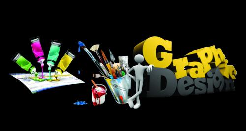
are few designs floating on the website surface. The graphic design services providers in India,
which are part of the website designing agencies, have included the following
designs in the forbidden list. Constant analysis and monitoring the trends
blooming around the world make it easier to stay updated and willing to explore
the newest dimensions. If by any chance,
your website has these elements, you supposedly know what is to be done.
Bevel
and Emboss
The
older versions of word and power point are still offering this design element.
Bevel and Emboss were everyone’s favorite at some time, early 2000 to be
precise. From call to action buttons, logos, and design boxes – everything
online was in bevel and emboss. So if somewhere on your website, or any
designed presentation, there is anything decorated with bevel and emboss, it is
the time to evolve.
What
has replaced the old ‘bevel and emboss’
Bevel
was, without any doubt, the most favorite that added a shiny ‘edges of clay’
effect to those boring designs enclosed in lines. It added more of a laminated
glossy appearance.
Basic
designs are more in trend right now. Instead of binge and bliss, designers are
keeping no more than required. That means, simple, straightly lay out and
uniform edges are more preferred. As of colors and effects, faint colors over
the chunky tones are picked. To make the design bit more noticeable in the
crowd, slight shadow tends to heighten the impact.
At
present, it is mostly used to decorate the call to action button. In India, Graphic design companies are
opting for gradient buttons with subtle shadow to add to the effect.
Cursive
Texts/Fonts
The
first thing you learn in the writing lessons is cursive writing. It may have
lost its high impact on web design and that’s it. Outside websites, there are
numerous designs charmed by the cursive fonts and text styles. As a matter of
fact, you are not bound to neglect this type face. It is the loosing impact as
the cursive fonts are no longer termed under the comfortable browsing.
What
has replaced the Cursive texts and Fonts?
No
point in forcing the website visitor to spend time adjusting to the cursive
reading. Searching the web, you can find myriad of fonts that are far more
impactful as well as more communicative (i.e. which are clearly easier to
read).
The
Burst
The
very first impression of the burst that comes to mind is of those pamphlets
that were sprayed with ‘Sale’ all over.
Now significant to its name, the burst was designed to give the
impression that a word has broke out of that particular spot. The web designers
embraced it with little more glitz. Together with graphic artists, they added
flashy color and blinking effects to make it the prime center of attraction.
Who can forget those oddly designed web pages back in 90’s that had these
bursts shining and shrieking for attention.
What
has replaced the Bursts?
As
per the design trends in India, the
website designing companies prefer simple templates minus flashes. Like
simple solution that snuggles well in the design template of the website looks
more appealing.
Post Your Ad Here
Comments