Implement Responsive Web Design Strategy for Improved Website Performance
According to the surveys conducted in 2015, around half of the
total people browsing the web is through a mobile device. And
approximately, about 80% of mobile users say that; if they won’t find; what
they want on a website, then they will leave that website and look for others;
which have more mobile-friendly versions.
Well, as a business owner, you must want to
prepare yourself to meet the unique expectations of the customers. But how is
it possible! And how will your business ensure that your web presence is mobile
friendly!
What Is A
Responsive Website
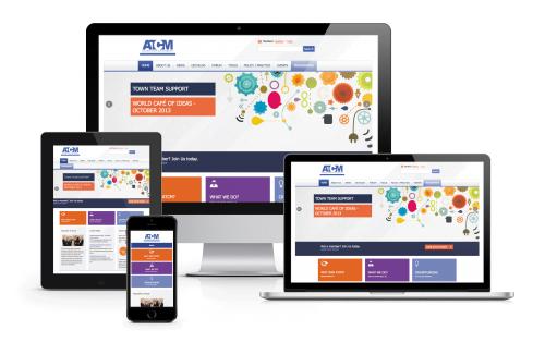
A responsive web design is an innovative web design strategy;
which makes dynamic changes to the look of a website so that depending upon the
screen orientation and size of the device user can browse them efficiently! In
fact, a responsive website can reformat the design and content automatically in
order to suit the size of the screen. Once your responsive website is created,
it can work efficiently on a wide array of screen widths, ranging from a
widescreen desktop monitor to the compact mobile phone screen.
Top 4
Amazing Benefits of Choosing Responsive Web Design Solution
Content Equivalence
People browse over the internet for collecting important
information on search engines. They communicate with other users through
emails. They go through blog posts, articles and books. While searching a website
on the web, they read customer reviews; compare prices and make purchases through
their mobile devices. That means, for some folks, a mobile device can be the
only way to access and browse the web! But with a responsive website, a mobile
user can get the same content and features of that particular website, no
matter whether they are browsing through a desktop computer or a smart phone.
No Need of
Multiple URLs
The second
benefit of considering a responsive design is that you don’t need to have
multiple URLs for different devices. With this innovative web design strategy,
you just need to have one unique URL; which will look good on every device.
Easy
Maintenance
If you want to create multiple versions of your website for
desktop, tablets or mobile devices, then you will need to update different
versions every time; in case of any change in the new web page.
But a
responsive website is quite easy to maintain; as it’s a single website which
can open seamlessly on different devices. When you will need to update the
website, the website administrators will have to update the changes on only one
platform. Therefore, an incredible amount of time and money can be saved!
User
Friendly Navigation
In fact, a responsive website offers a user friendly navigation
facility so that it can be useful in terms of controlling the bounce rate. Therefore, a lot of visitors can
be able to explore the website perfectly and get to know the relevant data on
the website. As a result, low bounce
rate can offer a valuable impact on the Search Engine Optimization strategy and
no doubt your website will get proper response from users and crawlers.
Getting the
Reliable Web Designing Services in India
If you want to improved your website performance on Google through Search engine optimization. I suggest you to hire a professional SEO Expert in Jaipur for rank your website on google. and you can also contact -
website designing company in
Delhi
Post Your Ad Here
Comments