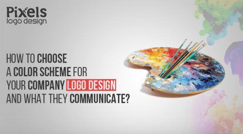
How to Choose a Color Scheme for your Company Logo Design and What They Communicate?
We humans have deep emotional responses to the visual
world around us. Our mind responds to visual cues and color is one of the major
defining elements that contributes to that response. Colors have been forever
associated with certain moods, feelings or events; in short, every color
conveys a meaning. The meanings of these colors also differ from culture to
culture which is why it is important to consider the emotional response it will
invoke in your customer when they see your company logo design.
The color scheme of your logo is very important as
understanding the color psychology is vital to your business logo's success.
Many designers globally specifically study color psychology to know the impact
their designs will create in their customer’s minds as colors could not be more
important in any field than that of logo design. After all, your company logo
design is a visual representation of your business.
How we use colors in our designs can bring up different
responses that are based on years of complex associations that humans make to
their surroundings. These associations can be used by companies in their
company logos to communicate their brand message and story effectively.
If you are a logo designer that is creating a company
logo design, you need to select your colors carefully so that it stays
consistent with your brand values and beliefs. The majority of times, this
difficult choice will not be left to you, mostly companies pick their own color
schemes beforehand so that you only have to work with different gradients of
their picked colors while designing their company’s logo. However, if the
client has completely trusted you with their project and you are at liberty to
choose whatever color you want, you might want to completely understand the
brand and try your best to capture the essence of that brand in your color
scheme. For example, Bright and bold colors in your company logo design scream
for attention, they are lively and fearless but run the risk of looking brash
if not used correctly. Same goes for dark, muted colors that convey a more
sophisticated image but may appear boring if not executed properly.
Below we’ve listed out some colors and what they commonly
represent:
- Red:
It represents warmth, heat,
passion and danger. It is also associated with appetite; hence you will see it
in a lot of restaurant logos.
- Orange:
It is seen as the color of
change and evolvement. It also denotes youth, fun, energy, and approachability.
- Yellow:
Yellow represents warmth,
sunny, fuzzy and friendly feelings. Like red, it is also associated with
appetite and you will often see it used in combination with red in different
restaurant logos. Most famously, McDonalds Logo.
- Green:
Green is most commonly used to
denote natural and eco-friendliness. Green is also associated with growth,
freshness and finances as it is the color of money!
- Blue:
Blue implies professionalism,
boldness, straightforwardness, integrity, calmness, and sincerity. It is also
associated with feelings of trust hence you will see its usage in a lot of
financial institutions logos.
- Purple:
Purple is associated with
royalty, luxury, and religion.
- Black:
Black is the color of power and
sophistication. Negative connotations of black include morbidity, death, and
evil.
- White:
White represents purity,
innocence, cleanliness and simplicity.
- Pink:
Pink is flirtatious, feminine and
fun.
The color associations mentioned above are not set in
stone. They mean different things when used in different designs but they are
worth considering when creating your company logo design.
Post Your Ad Here
Comments