Creating a Cozy Family Room With the Right Paint Colors
A family room is more than a shared space—it’s where daily routines slow down, conversations unfold, and memories quietly form. The right paint color can support all of that without drawing attention to itself. It can make a room feel welcoming after a long day, balanced during busy mornings, and comfortable enough to invite everyone to stay a little longer.
Choosing a family room color isn’t about following short-term trends. It’s about creating an atmosphere that supports comfort, connection, and long-term livability. As a trusted provider of residential and commercial painting services, Ash Painting of Central Oregon often helps homeowners select colors that perform well visually and emotionally in real homes, not just on sample boards.
Below is a complete, results-driven guide to the best family room paint colors, why they work, and how to choose one that fits your home and lifestyle.
Why Family Room Color Choice Matters More Than You Think
Color has a subtle but proven influence on mood and behavior. In a family room—where people gather to relax, talk, watch movies, or unwind—the wrong color can feel distracting or cold, while the right one quietly supports togetherness.
Family rooms often serve multiple functions:
-
A casual living space
-
A media or TV room
-
A place for kids to play
-
An informal entertaining area
That makes paint choice especially important. High-performance color selections help balance these uses without overwhelming the space.
Well-experienced painters often advise avoiding extremes. Colors that are too dark can feel heavy, while stark whites may feel unfinished or impersonal. The best family room colors tend to sit comfortably in the middle—soft, warm, and adaptable.
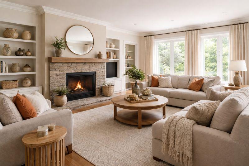
Warm Neutrals: A Reliable Foundation for Connection
Warm neutrals remain one of the best and most trusted options for family rooms. These shades create an inviting backdrop while allowing furniture, artwork, and personal details to stand out naturally.
Popular warm neutral options include:
-
Soft beige with warm undertones
-
Light greige (a beige-gray blend)
-
Creamy off-white with subtle warmth
These colors are top-rated for a reason. They reflect light well, work with most décor styles, and feel approachable rather than formal. In Central Oregon homes, where natural light can vary seasonally, warm neutrals provide consistent comfort year-round.
From a practical standpoint, warm neutrals are also user-friendly. They age well, hide minor wear better than bright whites, and remain visually relevant longer than trend-driven shades.
Earth Tones That Ground the Space
Earth-inspired colors create a sense of calm and stability—two qualities that naturally support family connection. These shades draw from nature and feel especially appropriate in homes surrounded by outdoor landscapes.
Effective earth tones for family rooms include:
-
Soft clay or muted terracotta
-
Warm taupe
-
Light olive or sage
-
Subtle sand or stone shades
These colors feel comforting without becoming dull. When applied correctly, they bring warmth and depth while maintaining balance. Industry-leading painters often recommend earth tones for households that want a relaxed, grounded atmosphere that still feels polished.
Earth tones also pair well with wood flooring, stone accents, and natural textiles—features commonly found in Central Oregon homes.
Soft Greens and Blues That Encourage Calm Interaction
While bold blues and greens can feel energizing, softer versions are far better suited for family rooms. Muted greens and gentle blues encourage calm conversation and shared downtime without overstimulation.
Best choices include:
-
Dusty blue-gray
-
Soft eucalyptus green
-
Muted teal with gray undertones
These shades are especially effective in family rooms used for movie nights or evening relaxation. When balanced with warm lighting and neutral furnishings, they feel soothing rather than cold.
From a design standpoint, these colors also scale well. Whether the room is large or compact, soft greens and blues adapt easily and maintain visual comfort.
Warm Grays That Feel Cozy, Not Cold
Gray continues to be popular, but not all grays belong in a family room. Cooler grays can feel distant, while warm grays create a more welcoming environment.
The best warm grays have:
-
Beige or brown undertones
-
Soft, mid-range depth
-
A balanced appearance under both daylight and artificial light
These proven shades work especially well in open-concept homes where the family room connects to kitchens or dining areas. A warm gray creates continuity without making the space feel flat.
Accent Colors That Strengthen Connection Without Overpowering
Accent walls can work in family rooms when used with intention. The goal is not drama, but focus.
Effective accent choices include:
-
A slightly deeper version of the main wall color
-
A muted earth tone behind a fireplace
-
A soft charcoal or deep olive used sparingly
A well-placed accent wall can anchor seating areas or define zones in larger family rooms. The key is restraint. One accent wall is usually enough to add character while maintaining balance.
Real-World Example: A Central Oregon Family Room Transformation
A recent residential project completed by Ash Painting of Central Oregon involved a family home with a large, open family room used daily by both adults and children. The original walls were painted a cool gray that felt stark, especially during winter months.
After evaluating lighting, furniture, and how the space was actually used, the team recommended a warm greige with subtle beige undertones. The result was immediate. The room felt brighter, more comfortable, and noticeably more inviting.
The homeowners reported spending more time together in the space, with fewer complaints about lighting or atmosphere. The color choice didn’t shout for attention—it quietly supported how the family lived.
This results-driven approach reflects why working with a well-experienced, reliable painting company matters.
How Lighting Affects Family Room Paint Colors
Lighting can dramatically change how paint looks once it’s on the wall. Natural light, window placement, and bulb temperature all play a role.
Key considerations include:
-
North-facing rooms benefit from warmer tones
-
South-facing rooms can handle slightly cooler hues
-
Warm LED lighting enhances earth tones and neutrals
Testing samples on multiple walls and observing them throughout the day is one of the most affordable ways to avoid disappointment.
Durability and Finish Matter Too
Color is only part of the equation. The finish you choose affects both appearance and maintenance.
For family rooms, high-performance finishes such as:
-
Eggshell
-
Satin
are often the best choice. They provide enough durability to handle daily use while still offering a soft, inviting look. These finishes are also easier to clean, making them a practical, scalable option for busy households.
Why Professional Color Guidance Makes a Difference
Choosing a paint color can feel overwhelming, especially when viewed under store lighting or on small swatches. Working with a trusted, industry-leading painting company helps bridge the gap between theory and real-world results.
Professional painters consider:
-
Lighting conditions
-
Room function
-
Existing finishes and textures
-
Long-term performance
This approach ensures the final result feels intentional, comfortable, and built to last.
Final Thoughts
The best family room paint colors are the ones that quietly support daily life. Warm neutrals, earth tones, soft greens, and balanced grays all have a place when chosen thoughtfully. These colors don’t compete for attention—they create space for connection, comfort, and shared moments.
With guidance from Ash Painting, homeowners across Central Oregon continue to achieve family rooms that feel welcoming, reliable, and genuinely lived-in.
Post Your Ad Here
Comments