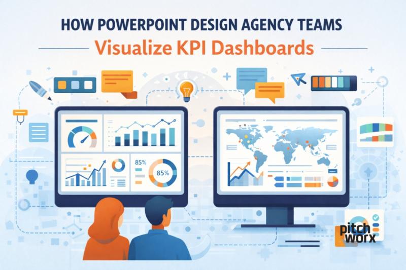
How PowerPoint Design Agency Teams Visualize KPI Dashboards
Quick Answer
The visual design agency for PowerPoint uses Key Performance Indicator Dashboard (KPIs) to take raw business intelligence and create a simple visual representation (via charts and icons) that is easily digestible by its target audience. Instead of creating dense slides with multiple numbers, the design agency focuses on key elements of business; the priority level of each metric, its purpose, and suggested action for individuals thinking of taking action.
Example:
A sales dashboard showing 30 metrics is redesigned into one slide highlighting Revenue Growth, Conversion Rate, and Pipeline Value, supported by clean charts and color-coded indicators. This is how a professional PowerPoint Design Agency in the USA helps leaders act faster and smarter.
Introduction
KPI dashboards are at the heart of modern business decisions. Whether it’s sales performance, marketing ROI, financial health, or operational efficiency, leaders rely on dashboards to track progress. But here’s the problem: most KPI dashboards are confusing, cluttered, and poorly designed.
This is where a professional PowerPoint Design Agency in the USA plays a critical role. Instead of simply placing charts on slides, agency teams apply strategy, design thinking, and data storytelling to transform KPIs into insights.
At Pitchworx, we’ve redesigned thousands of dashboards for enterprises, startups, and leadership teams, proving that great visualization isn’t about more data—it’s about better clarity.
Why KPI Dashboard Visualization Matters
Raw data does not drive decisions. Understanding does.
Poorly visualized dashboards often:
Overload slides with too many metrics
Use inconsistent colors and chart styles
Fail to highlight trends or risks
Confuse executives instead of guiding them
A PowerPoint design agency fixes this by aligning KPIs with business goals, audience needs, and presentation context. This approach is central to professional presentation design services.
Step 1: Understanding The Business Objective
Before design begins, agency teams ask the right questions:
Who is the audience—CXOs, managers, investors?
What decision should this dashboard enable?
Which KPIs truly matter right now?
A PowerPoint Design Agency in the USA never treats dashboards as decorative slides. They treat them as decision tools.
At Pitchworx, we first map KPIs to goals—growth, efficiency, risk, or performance—before touching design.
Step 2: KPI Prioritization & Data Simplification
One of the biggest mistakes is trying to show everything.
Agency teams typically:
Limit each slide to 3–5 core KPIs
Group supporting metrics logically
Remove redundant or low-impact data
This simplification is key to effective presentation design services. A clean dashboard allows executives to grasp insights in under 10 seconds.
Step 3: Choosing The Right Chart for Each KPI
Not all data belongs in bar charts.
Professional PowerPoint design agency teams carefully select visuals such as:
Line charts for trends over time
Bar charts for comparisons
Gauges for performance vs targets
Heat maps for intensity and risk
Icons for quick status indicators
The goal is not decoration but instant comprehension—a hallmark of a top PowerPoint Design Agency in the USA.
Step 4: Visual Hierarchy & Layout Structure
Great dashboards guide the eye.
Agency teams apply:
Clear headline insights at the top
Primary KPIs in dominant positions
Secondary metrics in supporting sections
Consistent spacing and alignment
At Pitchworx, we design dashboards using a Z-pattern or F-pattern, ensuring that attention flows naturally from insight to insight.
Step 5: Color Psychology & Status Indicators
Colors should communicate meaning, not personal taste.
A professional PowerPoint design agency uses:
Green for positive performance
Amber for warnings
Red for risks or gaps
Neutral tones for context
Consistent color logic across slides is essential for enterprise-level presentation design services, especially in board and quarterly review decks.
Step 6: Storytelling with KPIs
Data alone doesn’t persuade—stories do.
Agency teams structure KPI dashboards as mini-narratives:
What changed?
Why did it change?
What should we do next?
This storytelling approach transforms dashboards from static reports into strategic communication tools, a key value offered by a PowerPoint Design Agency in the USA.
Step 7: Custom Icons, Labels & Annotations
To reduce cognitive load, agencies add:
Simple icons for faster recognition
Short callouts explaining anomalies
Trend arrows and benchmarks
These small details elevate dashboards and are a signature of high-quality presentation design services delivered by experienced teams like Pitchworx.
Step 8: Ensuring Consistency Across Dashboards
Consistency builds trust.
Professional agencies maintain:
Uniform chart styles
Standard KPI naming
Fixed color rules
Reusable slide templates
This ensures that every dashboard feels part of one system, not disconnected slides—something leaders expect from a top PowerPoint Design Agency in the USA.
Free Presentation Design Tools You Can Use
While agencies bring expertise, there are free tools that can help beginners:
Microsoft Powerpoint (Free Version) – Basic charts and layouts
Google Slides – Easy collaboration and simple visuals
Canva Free – Beginner-friendly dashboards
Flaticon / Noun Project – Free icons (with attribution)
Colors – Color palette planning
However, tools alone don’t replace strategy. That’s where professional presentation design services create a real difference.
Common KPI Dashboard Mistakes To Avoid
Even with tools, avoid these mistakes:
Too many KPIs on one slide
Decorative charts without insight
Inconsistent scales and colors
No takeaway or conclusion
A PowerPoint design agency exists to prevent exactly these issues.
Why Companies Choose Pitchworx for KPI Dashboards
At Pitchworx, we combine:
Business understanding
Data storytelling
Advanced PowerPoint expertise
Global experience across industries
As a trusted PowerPoint Design Agency in the USA, we help companies turn complex KPIs into leadership-ready dashboards that drive action, not confusion.
Conclusion
KPI dashboards are not just slides—they are decision engines. When designed poorly, they slow teams down. When designed professionally, they align leadership, reveal opportunities, and support faster decisions.
This is why organizations rely on a PowerPoint Design Agency in the USA for dashboard visualization. Through smart prioritization, visual hierarchy, storytelling, and design discipline, agency teams deliver impactful presentation design services that turn numbers into clarity.
If your dashboards are full of data but low on insight, it’s time to rethink how KPIs are visualized—and that’s exactly where Pitchworx excels.

Post Your Ad Here
Comments