How To Choose the Right Colors for Your Flyers
When designing a flyer, color plays a major role in grabbing attention, conveying emotions, and highlighting your message. Whether you are promoting an event, a business, or a special offer, choosing the right colors can make a significant impact on how your audience view your flyer. Let’s take a look at how to choose the right colors for your flyers.

Understand Color Psychology
Colors evoke emotions and influence decisions. Different colors can trigger different reactions in people, so it is important to choose a palette that aligns with your flyer’s purpose.
- Red: Represents energy, passion, and urgency. It is perfect for sales flyers or promotions.
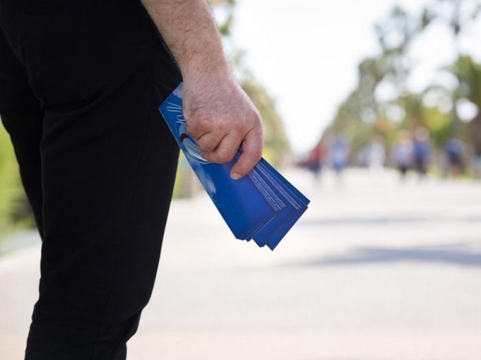
- Blue: Evokes trust, calmness, and professionalism. Suitable for corporate or business-related flyers.
- Yellow: Associated with happiness, warmth, and optimism. Works well for events and cheerful promotions.
- Green: Symbolizes nature, health, and sustainability. A good choice for eco-friendly businesses.
- Black & White: Often used for luxury, elegance, or minimalistic designs.
Know Your Audience
Your audience’s preferences and demographics should influence your color choices. If you are targeting a youthful audience, vibrant and bold colors may work best. On the other hand, a corporate audience may respond better to neutral and professional tones like navy blue or gray.
Keep Contrast and Readability in Mind
Your flyer’s main goal is to communicate a message effectively. High contrast between text and background ensures readability. Avoid placing light-colored text on a light background or dark text on a dark background. Instead of that, you can use contrasting colors to make the text stand out. Black text on a white or yellow background is a classic and readable combination.
Stick to a Color Scheme
Using too many colors can make your flyer look disorganized. Stick to a primary color scheme that includes:
- Primary Color: The main attention-grabbing color.
- Secondary Color: Complements the primary color and enhances balance.
- Accent Color: Mainly used for highlighting the call-to-action items.
A well-balanced color scheme makes your flyer visually appealing and gives an organized look.
Align Colors with Branding
If your business has established brand colors, use them regularly in your flyer to maintain brand recognition. This helps build trust and ensures your audience associates the flyer with your business.
Consider the Printing Process
When creating flyers baratos (cheap flyers), always remember that printing costs can vary based on color choices. Full-color printing may be more expensive than a two-tone or black-and-white option. If you are on a budget, choose a design that looks good even in fewer colors while maintaining visual impact.
Conclusion
Choosing the right colors for your flyers can significantly influence their effectiveness. By considering the above-mentioned factors, you can design a flyer that captures attention and conveys your message clearly.
Post Your Ad Here
Comments