2 Tips to design a Bar and Nightclub Logo Design – Wristband Effect

But the best foot forward at times is to cash in on this
amazing effect of deception – you’d ask me how? Simple – Create a brand image
with the most exclusive logo design after thorough research and in case of a
bar and nightclub logo design, my suggestion would be to taste the product, feel
the ambience. In short, this would be a night where you are on duty and cannot
get sloshed without taking in the vital tips for an uncommon customized logo
design.
Good Enough? – Beer Muscles!

Image Credits: http://salvadorcharlie.deviantart.com/
There’s that difference between knowing what you did is
great and finding out. It’s not about how it looks to you, it’s more about how
it would look to the masses, thus feedback is not only necessary but
significant to know what you’ve created could really compete and last with gigantic
competitors out there.
A design house, or an individual designer would
automatically research to the end of Google Threads (and extensive text book
research for some) to know how exclusive is their vision and design. What
matters the most at the end of the day is to accept that someone somewhere may
have the same trend or slightly close to an image – because if this is not
expected then it would only shock and depress you as a designer. Thus know it’s
out there, but don’t wait for it.
Furthermore, if one bar and nightclub logo design skyrocketed – that’s great –
but it’s always better to clean your slate instead of carry old weight and
intuition from the previous project. I am not referring to the archives a
designer has for inspiration but instead the values and specialty of each
design house differs thus it is essential to start afresh.
2 Balanced Typeface –
Buzz Kill
Most Nightclub Logo Designs tend to show off their specialty by utilizing different fonts that depict entertainment – I am on board with that. But fortunately time has changed or the below fonts would have continued to add to the boredom of the masses.
Disco 2000-

Free Style Regular –

Club Haus Bold –

Dance Floor –

To be honest, some of the above fonts can still be customized and look far better than what they currently are. But the retrospect of having them on a business card to that of a website, flyer, and not to mention a full billboard banner – would ultimately turn in to a gamble. All that actually matters is the ability of the average human eyes to catch your Bar and Nightclub Logo Design – basically it must be easily decipherable – as the blow examples displayed:
Old Folks Shuffle –

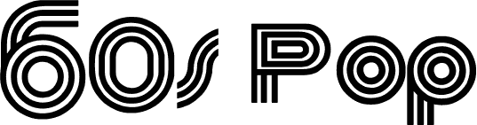
60’s Pop Regular – Always attractive-

Post Your Ad Here
Comments