Why choose a Responsive design for my website?
Responsive Web Design (RWD) has become the latest trend in the world of web design and development. What does it take for success? Should you tailor-made your website and make Responsive? In this post we will evaluate the benefits of transforming the design of our website.
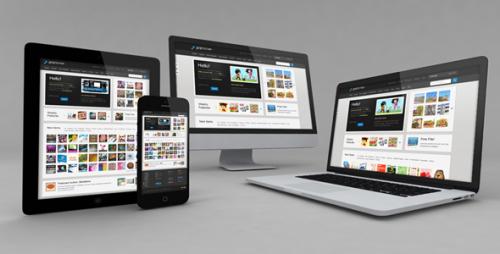
What is Responsive Web Design?
Responsive is an English word as equivalent in Spanish is the word "sensitive." In design, this term is used to define those websites whose interface is able to adapt to any type of device on which the website is displayed. Therefore, Responsive web pages are designed with "sensitivity", to detect changes in their environment, being able to transform the design to fit mobile screens, tablets or laptops.
Advantages of Responsive Web Design
- A unique design using the space of the whole screen. The main advantage of this type of design is the design of the website is the same for all devices. It does not only save time and money in your development but also eliminates the potential confusion for users to think that the site displayed in mobile is different from that found in the web.
- Save time and money. As discussed above, to develop a single website costs and development times also decrease.
- Improving the user experience. Both the design and typography images to suit every type of device and making better viewing experience more comfortable reading.
- Improved browsing experience. Responsive design guaranteesthat the website is displayed properly on all devices and the buttons will adapt according to the website to use touch, making it convenient and easy for user-navigation.
Why should I convert my website to Responsive?
Since 2012 numerous studies have shown how the use of laptops and desktop computers is shrinking at a rapid pace. According to a study published in the blog of Prestashop, around 34% of online purchases are made using tablets or mobile devices.

If you are not yet convinced, think of how much money you can save by hiring a web development which serves to all devices. Thus, the implementation of a mobile strategy for your website or developing an App for iPhone or Android is required.
Also, all your users will get the similar navigational experience, obtaining a visualization and a unified management, avoiding misunderstandings.
Adaptive or Responsive?
There is no definitive answer to this question. Everything depends on the type of content that you handle in your website.
WebAppTech (blog about Joomla!) Advised for Responsive design, while suggesting that in the case of online shopping is advisable to apply anadaptive design for tablets and laptops and make a design strategy exclusively for mobile. To carry out a full-fledged, professional project to make a good responsive design, at WebAppTech, we already are Responsive web Design Company and a Website Development Company. You can leverage on our skills and experience.
In WebAppTech all pages developed in WordPress or Joomla! Were with responsive design feature, as well as online shops developed in Prestashop .
In any case, we always recommend "think deep" and mobile design to design screens size medium or long.

Post Your Ad Here
Comments