 Articles
Web Design with Neon Color: Will Make or Break Your Brand?
by Jessica Bennett Tech Enthusiast“The right choice of color can make or break a brand!”
Yes, using the right color is that much crucial in web design.
According to web design experts, just like different rose colors represent different emotions, different color tones used in web design convey different messages to its visitors. Usually, the product assessment is done within 90 seconds. And between 60% to 90% of this product assessment is done based on the color alone.
So, it is of the utmost importance to choose the right color for your web design to make it user-engaging. However, in this article post, we are not going to talk about just any color. We are going to discuss how a touch of neon color in web design can do wonders.
Also, you will get a detailed insight on how to use the neon color, what to do or what not to do while playing with it. If you want to know about color psychology in web design, click here.
“Neon”ized Web Design
Playing with neon in web design is undoubtedly a tough task. Unless you are implementing it carefully, it will clash with the rest of your design and will ruin it.
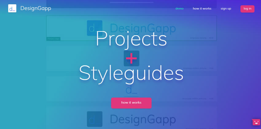
Recently, we have noticed plenty of websites that are mainly targeting the millennials, using this neon color in the design. The trend has become pretty popular. For instance, you can look at DesignGapp. Their team has utilized the neon color so intelligently that the website is looking so beautiful and engaging without any doubt.
Source: Specky Boy
Look at another example of Whomama Design! The entire aesthetic of this website design has been built around neon coloring. Even though some may find it a bit too much but you can’t disagree that the website design is giving a fancy feeling indeed. The eccentricities are pretty amusing in this neonized website design.

Source: Specky Boy
How to Use Neon Color Rightly?
Now that you have seen some great examples of using the neon color in web design, time to discuss how you can do the same and make wonders! Here is a list of a few dos and don’ts while using neon in website design.
Use lime green
According to some web design experts, lime color is the new neutral. It works great with almost any palette. When you use this color on a dark background, it successfully creates an instant impact. Playing with this color is fun and it makes the design more engaging in drawing the visitors’ attention.
Neon Rainbow - Nay!
Need to create an overall color scheme? Rather than using neon here, opt for other bright colors. In terms of saturation and brightness, most of the neon colors have almost the same values. When you use it on a screen, all will look kind of similar. And in terms of readability and contrast, this may cause some major concerns.
Incorporate Neon Colors from Branding
You know how the brand Mountain Dew has used the Neon color. Now, if you think that color scheme will go with your website design as well, no need to shy away. Go ahead and use it in your own way. The visual differentiation will set your website design apart from other sites that are using the same color scheme.
Neon on White Background - A Big NO
This chemistry just doesn’t work out together! If you use neon colors on a white background, the elements in neon color will be almost unreadable. So, while web designing, keep this fact in mind and use neon in other ways to get it's best touches.
Use Neon Accents
While playing with this color, keep one thing in mind that this color works the best where the contrast between the background and the neon element is high. So, using it on the black background works the best. Still, you can always do experiments.
When getting users’ attention is your main priority, using neon marks, buttons, lines along with other accents is the best deal. While web designing, to create a point of emphasis, you can include neon hues inside other elements.
Say No to Neon Text
In most cases, neon text comes with readability challenges. It is a good practice to avoid using neon texts. However, occasionally, it can work with a bold display typeface. Otherwise, it is advisable not to use it.
Other than the things we have mentioned so far, here are some additional tips on using neon in website design.
Make a bold color statement with neon
Try not to combine neon with other effects in web design
Let your neon colors glow
Better if you do not use clashing color palettes
Background neons are trending these days. You can try it out.
Play with neon but do not force it in your web design
Thus, keep these few things in mind and use neon color rightly to make your web design impressive and user-engaging. Getting assistance from a web design company in New York or related areas can make your job easier - as it is known to be a home for high quality designers.
Sponsor Ads
Created on Feb 3rd 2020 07:13. Viewed 509 times.

