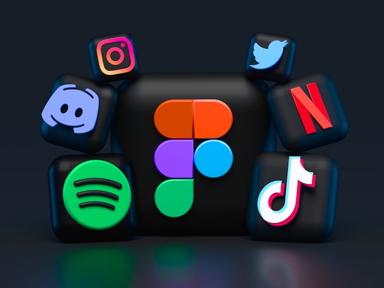
Tips To Design The Perfect App Icon
The icon of your app is the first thing that any user does when they are introduced to a new application. Therefore, you should design the app icon in such a way that it reflects the idea of the brand and is also able to stand out so that the customer will remember the application by just looking at the app icon.
Your app icon should be distinguishable and also gives a clear idea of the company’s motives and values. It should also be able to reflect the functioning of the company building a brand identity. So, if you also want to design a perfect app icon for your company, here are some tips that you can incorporate.
Find The Right Tool
To make a fabulous icon for your app, you need to have the right set of software with you. Some of the prime tools that you can use are Photoshop, Sketch, and Illustrator. Photoshop can be used raster effects like creating reflections and shadows. While an illustrator is used for making scalable designs for the icons. If you are looking for a user-friendly experience and pre-built templates for your icon, you can choose sketch.
Keep It Consistent With Brand Guidelines
Usually, brands go with quadratic-shaped logos to be able to remain recognizable on every mobile platform. However, brands can choose to design their logos in shapes other than squares like rounded squares or circles. The primary aim of a designer should be to match the icon design with the company’s design values so that the icon remains in sync with the theme of the company.
Moreover, the color, font, and elements that are used in the app’s icon should also fall in line with the brand identity. Therefore, a designer should be mindful of all these factors while making an icon for it to be perfect for the company.
In Sync With App’s Function
The app’s icon should also be able to convey the function of the app. Thus the icon should have a clear connection with the function of the app and the user can understand what the app is all about by just looking at the icon. For instance, if the app is a gaming app then the icon should have certain hints about the type of game the user will play after installing the app. Furthermore, you can also refer to the App Store screenshot guidelines to be able to use the screenshot section of the Apple product page. (you can read more about this at SplitMetrics blog).
This is important because when a company uses abstract icons, it leaves a user confused about the fiction of the app. They won't understand the meaning of the app clearly unless the icon conveys the purpose vividly. Therefore, you should try to design the icon in such a way that it hints to the user about the kind of activity that will happen in the app.
The Icon Should Stand Out
Your app’s icon should be noticeable and should stand among all the different types of icons in your genre. So before starting the designing process type the keyword of your genre and look for the different app icons present on the app store and make yours differently. However, this will also help you in creating an app icon that falls in line with the various app design in your genre. In this way, your app will not only be unique but will also look relevant to a particular genre.
To make your icon unique, you can experiment with colors and different font styles. You can also use a microscopic copy of your tagline at the bottom of the logo to make it look unique. Furthermore, you should also try not to fill the icon with too many elements and try to concentrate more on the core elements which can reflect the functioning of the app.
Follow The Latest Design Trends
You must have noticed that big brands like Facebook and Instagram have introduced a slight change in their logos over time. These changes are meant to keep the app icon aligned with the latest design trends. Earlier, most brands used digital images as their icons but over time they have re-designed their logos to satisfy the taste of the users. Moreover, nowadays brands refrain from using texts in their logos to work on the image in the logo so that it can better convey the message.
Check For Compatibility
The logo you are designing should also be compatible with the format of the logos that are specified by the app store. Usually, designers try to keep the sizes of their logos from 29 × 29 pixels to 1024 × 1024 pixels. This will ensure that the icon will fit in all the app stores and search result pages.
So, these were some of the things that you need to keep in mind while designing an app icon for your software. Follow each of these tips to have a perfect app icon.
Post Your Ad Here


Comments (1)
Genuus P.2
web developer
At the time, I was also puzzled by this question. This information will help people save a lot of time