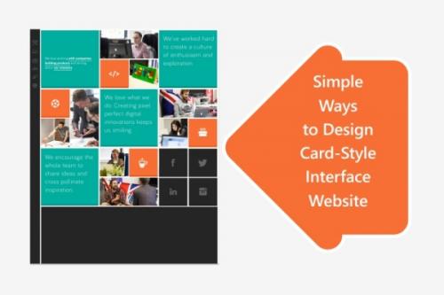
Simple Ways to Design Card-Style Interface Website

In this digital era, card-style interface is
becoming very popular in the domain of web design and mainly in mobile design.
You can see this format popping up everywhere from websites to apps as it looks
nice, delivers proper presentation of content and works on every kind of
devices by creating a distinctive organization. Here are a few simple yet
effective ways to design the card-style interface:
Use
plenty of space
Space plays a vital role in card-style design as
providing ample amount of white space allows readers time to see it, read it
and understand it. Too much text or image may not visually allow the viewer to
focus and pay attention to the details. Providing exaggerated space to each
element such as the image, content, call-to-action button and sharing link
helps in creating a powerful design.
One
bit of information per card
Though the point has been already stated that each
card design will have multiple elements, but it is better to keep only one part
of the information on one card to make it look organized. It lets the users to
choose parts of your content portfolio that they would want to absorb and
share.
Use
an eye-catching image
To create an attractive card-style design, it is
necessary to use a clear and crisp image that will draw the attention of the
users towards your message instantly. Most of the web design services focus
on providing unique images that work well in this competitive crowded web
space. As much catchy the images and the website would be the maximum attention
of the readers and viewers it will receive.
Use
plain typography
Go for black and white typefaces that are readable
and goes with any kind of design. Avoid too thin or too condensed font styles
that might just not work well with your design. Use Sans Serif as the font
style. Limit the typefaces from minimum one to maximum two of them. Also use
limited number of words to provide a greater and better impact on the viewers.
Add
natural colour and shading
To create an impressive design, use perfect blend of
natural colours and shades. Use dark colours at the bottom of the card by
letting adequate lighting to cast some shadows in order to get an extra effect.
Highlight your call-to-action button with the correct utilization of colours as
that will grab more attention of the viewers.
Insert
an unexpected detail
Though straightforward card-style interfaces do quite
well, it isn’t a bad idea to use an unexpected custom detail to your cards.
With a cropped cut-out, 3D effect or angled edge, your cards can double their
emphasis on the visual impact of the users.
Keeping in mind these design basics, you can create
your own card-style interface that can turn out to be aesthetically functional
and pleasing to the users. We Website Designing Company India believes
in simplicity as the motto of card-designing as it allows the users to read and
understand your project easily without any trouble. So, design your cards and
let each one of them perform the desirable function!
Post Your Ad Here
Comments