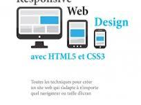
Responsive Web Design with HTML5 and CSS3

Create or customize your website for all browsers, TV and PC screens,
tablets and smartphones!
While the use of
Internet browsing multiply,
websites are often unsuited to the screen or
equipment with which they are consulted.
The layout of the site is fixed, the text is difficult to read, load times are increasing, and sometimes
the cost of developing ... With the principles of Responsive Web Design, develop sites
layout adapts a
harmonious and aesthetic all
media navigation!
With
the lessons of this book, you will develop reagents websites or improve
your existing sites. Your web pages will be displayed in an aesthetic way of all
types and sizes of screens,
your code will be easier to maintain,
and you will not waste time and development costs to create mobile versions
of your site.
You can easily master the techniques of advanced design
(fluid grids, flexible
images, media queries)
and learn how to use the new features of HTML5
and CSS3 to
enhance the user of your site (semantic tags,
media, transitions, transformations,
animations experience shadows,
typography, etc..), regardless of the
screen or the support
with which it will be viewed with
a camera today
or tomorrow.
This book is intended for all developers, integrators and web designers who want to learn techniques for creating or sites adapting Responsive Web Design.
Summary
• HTML5, CSS3 and
Responsive Web Design
• Media queries
and viewing areas
• Layouts fluids
• HTML5 for
reactive designs
• CSS3: selectors,
typography and color modes
• Aesthetic Effects with CSS3
• Transitions, CSS3
transforms and animations
• Forms with
HTML5 and CSS3
• Compatibility reactive
sites with all browsers
Post Your Ad Here
Comments