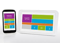
Mobile-friendliness becomes a key factor for successful website today
 The 21st April 2015 might appear to be just a normal day for all, but in
the world of web industry it is a day that will be remembered forever.
The search engine giant, Google on this day made it clear to the
businesses worldwide, that the whole notion of mobile-friendliness
should be taken more seriously.
 The statistics have made it clear, mobile users are increasing at an astounding rate. In the coming one-two years, the number of mobile users will overtake the desktop users. Such a huge amount of traffic is generated through mobile searches, yet a larger percentage of websites fail to offer a desirable mobile experience to its users.
Gone are the days, when optimizing a website for mobile was an option that you could use to improve your ranking and keeping customers happy. Today it’s a compulsion, and Google won’t think for a second before hitting you hard on this issue.
To maintain search order rankings, mobile friendliness is a thing you can’t miss delivering. And it is not just about mobile responsive web design. When you go in depth you’ll understand that there are plenty of things other than fluid responsive design that play an important role too.
Here is a list of some things you should keep in mind to create a mobile friendly web design that delivers great user experience across mobile device:
- Don’t try to make the mobile version a replica of the desktop, the screen size is different and even the user’s mindset. People look for quick information on mobile, and you should keep it in mind.
- Endless scrolling is a thing that hurts the most to the mobile users. Just because your content fits in the screen, it doesn’t mean to be extra long. There is no need of placing the entire content on a single page. Keep the important info in the first page and add some links so that users can access the secondary pages as well.
- Links and navigation should be placed in a manner that user don’t face any problem clicking them. Whitespaces should be intelligently used providing enough space between the links to ensure the right one is clicked each time.
- As said an image speaks more than thousand words, so it is also an important factor. Use fluid images for the website that look good on every screen size.
- Last but not the least,use a custom mobile web template to maintain your branding throughout.
Amaze, amuse and attract mobile customers by offering an unmatched user-experience to them. to achieve your goal efficiently.
Advertise on APSense
This advertising space is available.
Post Your Ad Here
Post Your Ad Here

Comments