 Articles
How to Optimize your Conversion Rate and the Google Website Optimizer
by Salim Benhouhou IT Support Please take note : This blog was written by Vodahost hosting company WE
HAVE IT ALL!!! Optimize your conversion rates, improve your website’s
profits AND get loads more customers with the Google Website Optimizer
and our Conversion Rate Optimization Quick Start guide! If you
read this entire article, you’ll actually know waaay more about
Conversion Rate Optimization (CRO) than about 95% of web marketers.
WE
HAVE IT ALL!!! Optimize your conversion rates, improve your website’s
profits AND get loads more customers with the Google Website Optimizer
and our Conversion Rate Optimization Quick Start guide! If you
read this entire article, you’ll actually know waaay more about
Conversion Rate Optimization (CRO) than about 95% of web marketers.
You want to see a Return On Investment (ROI) when you invest in a website and the Google Website Optimizer is a great way to make sure that you are making as much money as possible from your website. It allows you to actively explore and experiment with your website and allows two different people to view two different versions of the same website at the same time!
The Google Website Optimizer and Split Testing
 The Google Website Optimizer is split testing software and provides a powerful technique to optimize your website.
Split testing is exactly what it sounds like. You make a split in your website and test each side of the split on different groups of people.
If you had two possible headlines for your web page and you couldn’t decide which to use, you could run an A/B split test. What this means is that, for example…
- half of your visitors would be shown Headline A
- the other half of your visitors would be shown Headline B
You could then count up which headline brought you the most orders and then go on to use THAT headline on your web page from that day forward, knowing that you are using the best converting (“selling“) headline.
Google Website Optimizer lets you carry out tests like this. However, tests like this often take several weeks to finish as you gather all the data from different tests.
Split testing software provides a powerful technique for increasing your website’s conversion rate (that’s its ability to turn website visitors into paying customers). It is used by many of the web’s most powerful companies, including the mighty Google and even Amazon.com!
Getting Started with the Google Website Optimizer
- Visit: http://www.google.com/websiteoptimizer
- Sign in using one of your Google Accounts – If you do not have one, you should visit https://accounts.google.com/ to set yourself up with a Google Account. It’s completely free.
- You NEED a Google Analytics account to use the Google website optimizer so visit http://www.google.com/analytics and get your website set-up to use Google Analytics.
Click Here to learn how to get started with Google Analytics
Click Here to learn how to get started with the Google Website Optimizer
When you have a Google Account, a Google Analytics account AND finally a Google Website Optimizer account, you are ready to split test! Keep on reading to learn the awesome power of split testing and optimizing your conversion rates!
The real power of Google Website Optimizer comes from its ability to carry out loads of these tests at once!
Following my example regarding your A/B headline split above you could also test many other “page elements”—such as your text, images, prices, offers, buttons, etc.—all at the same time. Each of your visitors will see a different combination of these elements, then Google Website Optimizer will work out, on average, which of the elements performed the best. This can help you to put together a high-converting “super-page”.
You can test many different things all at the same time and the Google Website Optimizer will tell you which version of each page element, on average, brought in the most customers!
That’s pretty cool huh?
This type of testing is what’s called “multivariate testing” which means that you’re testing many different variables or variations on a theme at the same time.
What is conversion rate?
 When we say “conversion rate”, we mean the percentage of your visitors that end up reaching a given goal during the time period in question.
Typical goals include making a purchase, submitting an inquiry form, or signing up for a free newsletter so that you can gather emails for your email campaigns for instance.
Why you need to increase your conversion rate
There are three very important reasons you need to make conversion rates your number one priority for 2012.
- There’s always loads of room for improvement! Most websites are losing bucket loads of money each day because they do a terrible job of selling to their visitors.
- Pay-per-click will keep getting more competitive. And increasing your bids is not the answer.
- Split testing software is now highly affordable. Split testing software allows you to test changes to your website – and will tell you which changes brought in the most customers. (To help you decide which software is best for you, see this comparison of multivariate testing software). It used to cost several thousand dollars per month. Now it’s almost free. In the case of the Google Website Optimizer, it is actually free!
Unfortunately, the Google Website Optimizer doesn’t tell you what to test. That’s what this article is here to do.
You have a great deal of work ahead of you. When you’re done here, you need to clear your mind and start working hard on increasing the conversion rate of your website!
Don’t be daunted by our “Split-Testing CheckList” below – if you do everything on it, you’re the best marketer in the world! In reality though, doing just one (just about 1%) of the below things could be enough to double your conversion rate. The most important thing is to do something – now!
So, let’s get started!…
Your Split-Testing CheckList
 First you’ll need to choose which split (or multivariate) testing software to use:
Time split tests (aka “before-and-after” tests) You should avoid these. Orders do go up and down from week to week and we’ve found that time-split tests tend to lead to wrong decisions.
A/B split tests – There are many occasions where a simple A/B split test (just like I mentioned with the headlines above) is all that’s needed to make your decisions.
Multivariate testing – See the differences between all the multivariate testing solutions at “Which Multivariate?” which is a free resource for choosing split testing software.
Split testing software becomes much more powerful when you use it alongside other tools. Here are the other tools and techniques you need in your marketing arsenal…
Google Adwords – is often wrongly used to run split tests by creating two identical ads with different destination URL’s. We don’t recommend using Adwords to split test in this fashion – We recommend the Google Website Optimizer!
Live Chat – You very rarely get any information about your “non-customers” other than one more unique visitor on your hit-counter; as they don’t buy anything you do not get any feedback! They probably will not phone you up but they might just be persuaded to use a Live Chat feature.
Web analytics – You can learn loads from your Analytics. At the most basic level, the “site overlay” feature tells you where people click, where they don’t click and where they leave your site. Some say “there be gold waiting for you in them log files” and they are right.
Usability tests – these can be carried out on pretty much anyone you can get your hands on (and many people will help you out no end for beer and pizza). They are just about as valuable as gold itself.
If we could have just one testing tool, it would be usability testing. Web analytics tells you what visitors are doing, but usability testing tells you why. No other tool provides so many headslapping “I can’t believe I didn’t think of that!” moments.
In your refer-a-friend program, allow the customer to send a personalized note to their friend. You will have access to these notes (privacy policy permitting) and they are a goldmine of information about why the customer actually ordered. In addition, you get to see the exact words the customer uses to sell your product to their friends. It’s like having a team of free copywriters on tap.
Eyetracking – shows you which things people see but don’t click. And which things people don’t click because they don’t see. Got that? Most eyetracking is carried out using custom hardware, so you need to get a company to do it for you. However, there’s a startup called GazeHawk that utilizes normal webcams to provide budget-priced eyetracking.
“Poor-man’s eyetracking” – About 5 seconds into each usability test, ask the person what they have looked at so far (one of your beer ‘n’ pizza recruits). They’ll find it pretty easy to tell you what stands out at a first glance.
Clickmapping
• Crazy Egg is a service that allows you to see the parts of your page that your visitors click on, and how far they scroll down your pages
• ClickTale
is similar, but allows you to view Flash movies of your visitors’
browsing sessions! You can see how far people scroll down your pages,
how they interact with your forms, and many other aspects of their
visit.
Customer surveys – Your customers know why they ordered and why they maybe nearly didn’t. So, ask them questions about it. There are loads of survey services available. SurveyMonkey is a leader of the market.
Co-opetition is short for “cooperative competition”, this is a technique by which you sell your competitors’ products from your website (usually via an affiliate program). Co-opetition can teach you a lot about your competitors’ conversion rates. And if your visitors prefer your competitors’ products, this is an easy way to find out!
Test Changes to Your Website with the Right Mindset
 Here are some tips to getting into the right mindset:
Stop having debates with your colleagues about who likes what. If in doubt, test. Your motto should always be “let the customers decide”.
Start to think of your business as a constantly-shifting experiment. Don’t just test your favorite ideas. Carry out tests “just to see what happens”. For example, what would happen if you lowered your prices by 30%? Or increased them by 30%? It’s the only way you’ll learn what matters to your customers.
Learn your other new mantra: When people in your company object to the changes you’re making, remind them that this is just an exploratory experiment to “learn what happens”, not a long-term decision. Let this become your mantra: “It’s just an experiment”, “It’s just an experiment”.
Copy what works for others (within limits). In particular, copy companies that appear to be tracking and testing. You can spot them because they are using the techniques in this list.
Copy the techniques that have been developed by people who have been testing for decades: that is, copy direct response advertisers. The internet may be new, but your visitors aren’t. For about a hundred years, direct response advertisers have been running split tests to find out what works. It’s easy to spot their ads in magazines, newspapers and direct mail – they have tracking codes and coupons on the bottom corner. And they often look a bit cluttered.
Place bets with your colleagues as to which of your test samples will win. You’ll be amazed at how often you are wrong. Only the top few percent of marketers appreciate that it’s impossible to always spot the winner. Race to become one of them.
Make sure you have great people working on this project: This is the most important job in your company. You have three options:
- Do it in-house, with your best staff.
- Get some ‘experts’ in… and do it in-house.
- Outsource it to an expert who has a vested interest in making it a big success.
Locate (or become) your company’s best salesperson. Your website is your electronic salesperson. It has the advantage of being able to sell to thousands of people at the same time. However, only person-to-person selling will teach you the reactions of prospects to certain types of argument and approach. It is by far the quickest and most effective way of finding out what appeals to your prospects and what doesn’t. The words on your website need to have been tested on real people. No amount of online testing will give you this gut feel. So you have a choice – either become your company’s best salesperson, or seek out the best salesperson and listen to how they sell the product.
Don’t test the small stuff. Test big bold changes. This has two advantages
- You’ll get your results quicker.
- You’re more likely to get big improvements.
Two stages of testing:
- Fix all the things that are “broken” (which you’ll discover during your usability tests). This is worth doing first, because it’s the easiest way to make quick improvements.
- Testing new ideas that have the potential to significantly grow your business. Do this next.
Don’t worry about temporarily lowering your conversion rate. If a test is a failure, you get one bad day of business. If a test is a success, you get a lifetime of success.
Don’t end the test too soon! Make sure you have enough data! Some people say you need to test for two weeks. Some people say you need to collect at least 30 orders. Some people use “gut feeling”. They are all wrong. The only correct answer is to use the right statistical tool.
- Use this tool for split tests of AdWords ads.
- All multivariate testing software contains in-built statistical analysis.
These tools tell you whether your results are significant – or whether you haven’t got enough data yet, and they are just due to some random “luck-of-the-draw”.
What To Focus On First
 The best place to start is by identifying the weak links in your marketing funnel.
Sketch out a brief overview of your marketing funnel, from advertising
all the way through to closing the sale. This will include…
The best place to start is by identifying the weak links in your marketing funnel.
Sketch out a brief overview of your marketing funnel, from advertising
all the way through to closing the sale. This will include…
- Your ads
- Your force of sales folk or materials
- Your homepage
- Your product page(s)
- Your checkout page(s)
- Your order confirmation page
- The staff at your call center
- How your package is sent out
Test stuff that your usability tests suggested you change!!! (Otherwise, why did you do it?!?!?!)
Getting your message straight before you start
What’s your company’s positioning? In other words, what makes you different from or better than all your competitors? Have you ever tested it against possible alternatives? Draw up a shortlist to test – then your visitors can let you know which is most important to them!
Rank the top 5 points you want to communicate to your visitors. You want to make sure that, whatever else your visitors learn from your site, they definitely learn these top 5 points.
Consider all the different types of person who might view your site – try to write for all of them. You might find it easier to use a customer archeypes (sometimes called “personas” or “avatars”) for this. A customer archetype is a single person who is used to represent a certain segment of visitors.
- You may choose to use real people as your archetypes (for example, a customer you know well, who is characteristic of a certain segment of visitors)
- or you may choose to create fictional characters who embody the characteristics of a certain segment of visitors. Warning: if you choose to use fictional characters, be sure that you’re basing them on an understanding of your real visitors. We don’t want you sitting in an ivory tower, dreaming up people who don’t exist.
For each page, make sure you know what all the “visitor intentions” are. For example, some visitors might be looking to make a purchase, some might be looking for customer support and others might be trying to apply for a job with you.
Instead of just guessing their intentions, survey them to find out for definite. The 4Q tool is a free easy-to-implement tool for getting started. Some of our clients choose to create their own exit surveys.
What to Test
Test everything! Or rather, test all the variables that are humanly possible for you to test. If you test it now, you will have the answer. If you do not test it, you will never be any the wiser!
Identify which products bring you the most overall profit, then put them in prime position on the page, which will be above-the-fold (that is, on the upper part of the page so the user doesn’t have to scroll down to see it), preferably on the left-hand side.
Headlines are extremely important. If your visitor doesn’t like the headline, they won’t read any further. A simple-yet-effective approach is to express your main message in a headline that:
- is worded in terms of benefit to the customer, not in terms of product features,
- suggests that the person will get the results with ease,
- is believable and therefore contains some kind of proof
- is specific.
What you say is more important than how you say it. You’ll get the biggest improvements by changing the core message of your headline, rather than just tweaking the wording.
If you don’t know how to describe your product’s features in terms of benefits, carry out this exercise: imagine the customer is looking at your headline and asking “Why should I care about that?” The way you would answer their question is likely to be worded in terms of a benefit.
Struggling for a good headline? Adapt headlines from publications such as Cosmopolitan magazine, Reader’s Digest or MSN.com, who use formulaic headlines that have been proven to work again and again. Today MSN has “7 ADHD truths you may not know” as a headline. Replacing “ADHD” with your product name would give an instantly compelling headline.
I cannot emphasize enough how important Headlines really are in capturing your visitors by the imagination!
The tagline under your logo will be viewed almost as much as the headline. So make sure it clearly expresses distinct “positioning”; that is, describing what you do and how you fit into the marketplace.
Test high and low prices – your customers aren’t always seeking out the lowest prices. Things can be “reassuringly expensive”.
Test odd-pricing. Odd pricing is prices that end in 9’s and 7’s (such as … just $99.99 or $7.99 etc.). These tend to sell better. Would you or I be fooled by that? No, we’re far too smart. But someone’s falling for it, because this phenomenon has been proven over and over again.
Test different offers. Here are some examples…
- a one-month free trial
- buy-one-get-one-free
- pay in installments
- a longer commitment
- a shorter commitment
- buy now, pay later
- first one free
- automatic renewal
- holding a cheque for 30 days
In general, do everything within your power to get your product into the hands of your customers. If you’re so confident in your product, prove it by taking some of the risk.
Divide your product or service into a standard version (for the prospects who are price-sensitive) and a premium version (for the ones who aren’t). This also has the psychological advantage of turning the prospect’s decision into an either/or decision, instead of a yes/no decision.
Even more extreme than the above two options, try changing what you sell. For example, are you selling…
- the product itself
- a catalogue of products
- a free report about the product or about the problem
- an invitation for a sales person to call
In general, the larger the purchase, the less effective it will be to attempt to sell it in one step.
Many of the visitors who leave without ordering will do so because you don’t offer the product or service that they are looking for. The answer is often to start selling what they are looking for, or at least become an affiliate of a company that does sell it.
Test different premiums ( the bonuses your customers get if they purchase. Free stuff like reports, gifts and accessories.
Add a guarantee or test different ones. Start with the bravest guarantee you dare test and if it should work, test an even more daring one.
Add testimonials from happy customers. In general, a video testimonial is better than a testimonial with an image, which is better than a testimonial with just a name, which is better than an anonymous testimonial.
Add testimonials from the media. If you don’t have any, try giving them free stuff in exchange for reviews and feedback.
Develop a systematic way for collecting testimonials. Train your sales staff to request a testimonial whenever they receive a compliment. Email your customers asking for testimonials.
Test different “calls to action”. The call to action is what you want them to do next. It is often written on the ‘proceed’ button. Test direct ones such as “Buy Now And Get 10% Off” as well as indirect ones such as “Learn More”.
Try making the “call to action” button nice and visible. Large brightly-colored buttons often convert and sell more effectively as they are more effective at drawing the customers attention!
Test different reasons why the visitor should act promptly. For example, “offer must end Midnight Friday”, or “just 3 units left”. Please note, we’re not suggesting you lie to any of your visitors – your conversion rate depends heavily on their trust. However, if you look, you’ll probably find that your own business already has real reasons why the customer should act fast. If not, you can find ways of incentivising them to do so.
Make the right stuff (your very best benefits) jump off the page! Here are several ways to make this work:
- Use bold,
- Use italics and
- Highlighting important words
Testing the Layout of your Website
 A single-column layout allows you more control over the order in which your visitors view your site.
When a visitor sees your page, make sure the things they see first are
the things you want them to see. This is one of the reasons for the
effectiveness of those long pages in the style of single-column long
sales letters; because they have more control over the order in which
the visitor views the page.
A single-column layout allows you more control over the order in which your visitors view your site.
When a visitor sees your page, make sure the things they see first are
the things you want them to see. This is one of the reasons for the
effectiveness of those long pages in the style of single-column long
sales letters; because they have more control over the order in which
the visitor views the page.
Where do people look? Eyetracking studies have shown that visitors tend to look first at the upper-left-hand area of the page, then at your headline, then at the left-hand side of the page. So put your best features there.
Remove clutter from your web pages! Imagine that every single pixel and every little bit of space on your web pages either increases the conversion rate or decreases it – or just takes up space. If you can get rid of things that aren’t working, you create more space for the things that are.
Put all the best stuff “above the fold”. A surprising number of your visitors will not scroll at all, so it’s best to make sure that the most important content is placed “above the fold”.
Decide what to feature on your homepage. Write a list of the things that your visitors are looking for. Chances are, their intentions can be divided into categories and sub-categories. Allocate space on the web page according to the popularity (and value) of these categories.
On a similar theme, consider having a list of your top-selling items. These lists are popular, because visitors find it reassuring to buy products that others have bought.
Test different structures for the navigation of your website.
If you’re confident your visitors are on the most relevant page for their needs, consider removing the navigation bar (or at least moving it somewhere less prominent). In such cases, navigation bars can be a distraction.
If your website has a “cool” non-conventional layout, try a conventional layout. Conventions are conventions for a reason – they make it easier for visitors to find what they are looking for.
Remove any distracting links that lead to places you don’t want them to go! Does your site contain any gratuitous links that you never really considered your visitors might actually click on? … Get rid of them!
Use a font for your headline that is large and clear.
Make the first letter of your body copy a large “drop caps” letter. Drop caps letters are especially good at “bridging the gap” between the headline and the body copy.
For the same reason, consider having your introductory paragraph in a slightly more prominent font size or appearance.
Test different images. The following tend to be most effective:
- images of the product
- images of the product being used , maybe by a “role model” character
- images of the successful outcome of the product
- images of happy customers holding the product (that is, a testimonial and product shot all in one).
Attention-grabbing images are great, but only if they help to communicate your sales message (which they rarely do).
Test giving your visitors the option to “zoom-in” to see a larger image of the product. (It’s surprising how few e-commerce sites have decent-sized images, isn’t it?)
Put captions under your images and test them. For some weird reason, people almost always read the captions under images.
Call-outs (that is, text pointing to particular parts of the picture) tend to be effective.
Test Violators, which are attention-grabbing shapes such as starbursts, ovals and banners.
If your page is long and requires scrolling, consider having your call to action button repeated several times on the page.
If your page requires scrolling, make sure that there are no “false bottoms” – that is, elements of the layout that imply the customer has reached the bottom of the page when they haven’t.
Many websites find they get higher conversion rates if their page is set out in the form of a sales letter with a personable one-to-one style of writing. Despite what your feelings might be about such websites, in some markets they often work.
Your Website’s Text aka Body Copy
 There is a big debate about how much text to include in the body of your web pages. In general, write as much as it takes to communicate all of your “sales message”
and to handle all the objections that are obvious to you. You are
aiming to condense as many persuasive arguments and relevant information
into as little text as possible. This will usually require more words
than most websites currently use.
There is a big debate about how much text to include in the body of your web pages. In general, write as much as it takes to communicate all of your “sales message”
and to handle all the objections that are obvious to you. You are
aiming to condense as many persuasive arguments and relevant information
into as little text as possible. This will usually require more words
than most websites currently use.
Use simple straightforward language. Short simple sentences are all that you need; they are not putting anybody off – Long ungainly and complicated sentences, on the other hand, are.
Fill your body copy with benefits as well as you product features. If you can, in fact, add more benefits than features because while features merely tell, benefits sell!
Include all the information that a customer could possibly require in order to make a purchase. Note that it doesn’t all need to be on the main product page.
Make sure you address all the common objections that your customers bring up. As preparation for this, you might find it useful to compile a chart of objections and counter-objections, then rank them in order of importance.
Test several different font sizes to make your text as readable as possible.
Test several different font colors. For the main text in the body of your website, black text on a white is usually a safe bet – It has been the standard for many thousands of years.
Near the end of the body copy, consider having a series of bullet points (or, even better, check-marks) that summarize the major benefits of purchasing the product that is described above.
Rewrite your article for people who skim read. Use sub-heads (that is, headlines dispersed throughout, like where we wrote “Body Copy” above) and bold to make sure the right things stand out!
Consider putting the start of your order form on the product page itself so that the process of buying your product has already begun before your visitor knows what happens.
Using Multimedia on your Website
 Using multimedia such as Audio can be really effective at selling a product Check out: Xiosoft Audio as an easy way to put audio onto your website.
Video can be really effective too! Perhaps the easiest way to add videos to your website is to embed video’s from YouTube
One particular service, called OnSite Videos, is really useful. You submit a script to them, then choose one of their actors to read it out. They then send you some code to add to your website, which displays the finished video, which hovers at the bottom of the browser.
Optimizing your Shopping Cart
 You
know from your Analytics just how many people abandon their shopping
carts before they reach the checkout. Optimizing your shopping cart so
that your visitors don’t leave before buying your product or service!!!
You
know from your Analytics just how many people abandon their shopping
carts before they reach the checkout. Optimizing your shopping cart so
that your visitors don’t leave before buying your product or service!!!
Repeat your offer and main benefits on the first page of your shopping cart or order form. Some customers click on the Buy Now button just to see what the price and shipping cost will be, so you don’t want to miss out on this chance of persuading them.
Don’t ever ask for too much information because this can really put off your cutomers. Do you really need details like a fax number? Asking for more details than you need WILL result in your losing out on sales!
We have found that having thumbnail images of the products in your cart for your customers to see increases the chance of them completing the order.
Always provide timely reassurance as to why you need any and all of the information you ask for. For example,
- Under the email field, add a phrase like: “We hate spam as much as you do” – and consider including the HackerSafe logo.
- Under an email newsletter opt-in, you should always add a link to your privacy policy.
- Under the “Order Now” button, always remind your customers of your guarantee and returns policies.
Use technologies like Ajax or DHTML to hide the parts of forms that aren’t needed. Both of these technologies allow sections of the page to be opened or collapsed without reloading the whole page. On the BBC’s homepage have a click on those little triangles and plus and minus signs.
You should aim to replace long drop-down lists with an Ajax alternative, to increase the chance – and the speed – of the customer finding what they are looking for. Type in “Paris” in the “Plan the Perfect Trip” part of the Trip Advisor homepage, for example and see what happens.
Show additional ways to order – for example, by phone or by fax. Each customer has a way that they prefer to order. Sometimes the presence of the phone number itself can increase reassurance, even if the people don’t actually phone you.
Do you have an “enter your coupon” field on your shopping cart? Test whether this is turning people away. (People often resent ordering when they see that others are getting a better deal).
Even Borrowed Credibility is still Credibility!
Try adding a few “reassurance logos” to your web pages or sales pages and see what effect they have on converting visitors into customers.
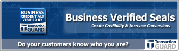


The Transaction Guard Website Seals are an easy, fast and credible way to reassure your visitors (prospective customers!) that you are who you say you are. By displaying seals like the above, your customers know at a glance that your business credentials and privacy practices have been verified by a respected third party. – Reassured visitors will buy more products from you!
The Structure of Your Website
Try out a few different versions of your “About” or “About Us” webpage – In general show yourself to be real, down to earth people and certainly not some cold, sterile and faceless corporation
Always keep your message to your visitors consistent throughout your sales-page, website and all the way from the first Ad your customer sees right though to the point they place their order.
Immediately after the customer has ordered they tend to be in a particularly agreeable mood (we sometimes refer to this phenomenon as the “yes set” or “yes ladder”). You should always take advantage of this by making additional offers to them…
For example, adding a good refer-a-friend program to your order confirmation page can be really effective.
Your order confirmation page is also a useful place from which to sell other of your products. In sales-speak this is known as cross-selling.
Entry pop-ups and exit pop-ups should be tested but you have to be really careful how you deploy any kind of pop-up. They can work well but quite often that can be very irritating to users.
The “Usability” of your Website
 Always check how your website looks when it is viewed through different web browsers and using different screen resolutions. This will give you some great insight into how your visitors are seeing your website. http://www.browsercam.com/ and browsershots.org are a couple of really useful tools for doing this!
Make the loading time of your website as fast as possible! (check your site using this handy little tool).
Add a Search feature to your website Two tools that both let your visitors search your website via Google are: Google Mini and Google Free Web Search. You can then have a look at your Analytics to learn what your visitors were mostly searching for. Once you know what your visitors are looking for, either make sure that your website offers it or make it more prominent on your site so that your visitors can find it faster!
Make as many elements on your website as you can clickable.Your visitors tend to click on everything, in particular the images on your website and if they are clicking on something, it’s because they are expecting something to happen.
If your site has adverts, test changes to these. You can split your advertising into two or more channels with many advertising programs (for example: Google’s AdSense and Chitika). Once you have done this, check the below and start testing to see which brings in the most money
- Different ad sizes
- Different ad shapes
- Different ad positions
- Different ad color formats (“stand out” versus “blend in”, for example)
Happy testing!
Sponsor Ads

Created on Dec 31st 1969 18:00. Viewed 0 times.

