Creating The Perfect UI/UX Design - Part 2
This is the second part in a two-part series. You should read the first part first.
We’re talking about rules for designing clean and simple UI without needing to attend art school in order to do so.
Here are the rules:
Light comes from the sky (see Part 1)
Black and white first (see Part 1)
Double your whitespace (see Part 1)
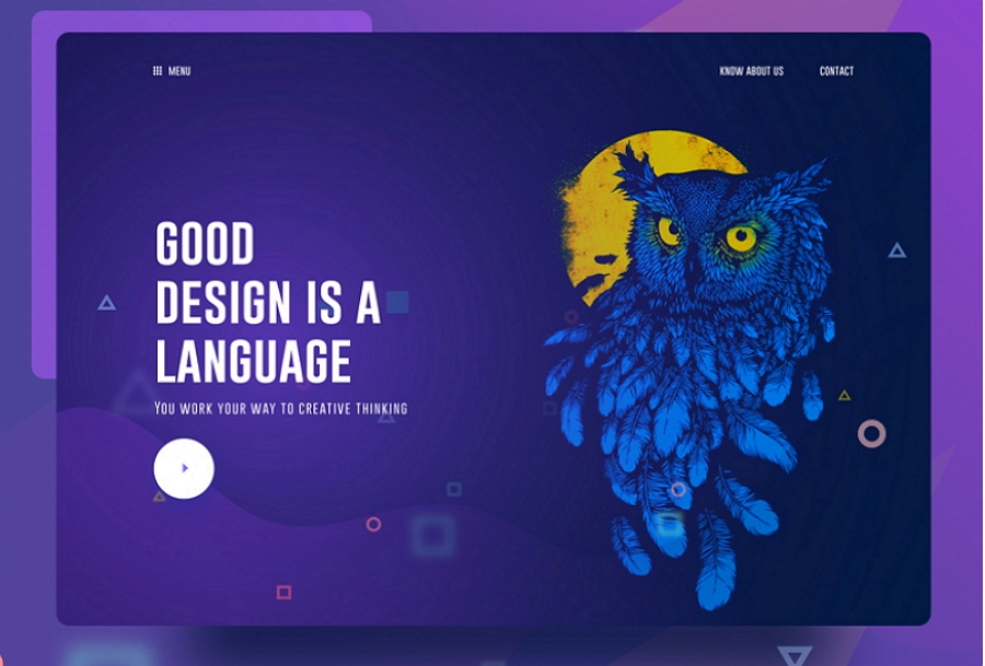
Learn the methods of overlaying text on images
Make text pop— and un-pop
Only use good fonts
Steal like an artist
Rule 4: Learn the methods of overlaying text on images
There are only a few ways of reliably and beautifully overlaying text on images. Here are five— and a bonus method.
If you want to be a good UI designer, you’ll have to learn how to put text over images in an appealing way. This is something that every good UI designer does well and something every bad UI designer does piss-poorly— or just doesn’t do, in which case you’ll have a huge leg up after reading this section!
Method 0: Apply text directly to an image
I hesitate to even include this, but it is technically possible to put text directly on an image and have it look OK.
There are all sorts of problems and caveats with this method:
The image should be dark, and not have a lot of contrast-y edges
The text has to be white— I dare you to find a counter-example that’s clean and simple. Seriously. Just one.
Test it at every screen/window size to make sure it’s legible
Got all those? Great. Now never change the text or the image, and you should be good to go.
I don’t think I’ve ever used text directly on top of an image for any professional project, and it’s really mentioned here as a sort of “control” method. That being said, it’s possible to do to really cool effects— but be careful.
Method 1: Overlay the whole image
Perhaps the easiest method to put text on an image is to overlay the image. If the original image isn’t dark enough, you can overlay the whole thing with translucent black.
This method also works great for thumbnails or small images.
And while a black overlay is simplest and most versatile, you can certainly find coloured overlays as well.
Method 2: Text-in-a-box
This is dead simple and very reliable. Whip up a mildly-transparent black rectangle and lather on some white text. If the overlay is opaque enough, you can have just about any image underneath and the text will still be totally legible.
You can also throw in some colour — but, as always, be judicious.
Method 3: Blur the image
A surprisingly good way for making overlaid text legible is to blur part of the underlying image.
You can also use the out-of-focus area of a photo as the blur. But beware— this method is not as dynamic. If your image ever changes, make sure the text is always over the blurry bits.
Method 4: Floor fade
The floor fade is when you have an image that subtly fades towards black at the bottom, and then there’s white text written over it. This is an ingenious method, and I have no idea who did it before Medium, but that’s where I first noticed it.
Rule 5: Make text pop— and un-pop
Styling text to look beautiful and appropriate is often a matter of styling it in contrasting ways— for instance, larger but lighter.
In my opinion, one of the hardest parts of creating a beautiful UI is styling text— and it’s certainly not for unfamiliarity with the options. If you’ve made it through grade school, you’ve probably used every method of calling attention to or away from text that we see:
Size (bigger or smaller)
Colour (greater contrast or lesser; bright colours draw the eye)
Font weight (bolder or thinner)
Capitalization (lowercase, UPPERCASE, and Title Case)
Italicization
Letter spacing (or— fancy term alert— tracking!)
Margins (technically not a property of the text itself, but can be used to draw attention, so it makes the list)
There are a few other options that are possible for drawing your attention, but not particularly used or recommended:
Underline. Underline means links nowadays, and it’s not worth trying to force it to mean anything else if you ask me
Text background colour. Not as common, but the 37signals website had this as link styling for a while
Strikethrough. Back off, you 90s CSS wizard, you!
In my personal experience, when I find a text element that I can’t seem to find the “right” styling for, it’s not because I forgot to try caps or a darker color— it’s because the best solution is often getting right a combo of “competing” properties.
Up-pop and down-pop
You can divide all the ways of styling text into two groups:
Styles that increase the visibility of the text. Big, bold, capitalized, etc.
Styles that decrease the visibility of the text. Small, less contrast, less margin, etc.
We’ll call those “up-pop” and “down-pop” styles, in honour of designers’ favourite adjective. We won’t call it “visual weight”, because that is boring.
Lots of up-pop going on with the “Material Design” title. It’s big; it’s high-contrast; it’s very bold.
The items in this footer, on the other hand, are down-popped. They’re small, lower-contrast, and a less bold font-weight.
Now the important part.
Page titles are the only element to style all-out up-pop.
For everything else, you need up- and down-pop.
If a site element needs emphasis, apply both up-pop and down-pop styles. This will prevent things from being overwhelming, but allow different elements of the visual weight they should have.
Selected and hovered styles
Styling selected elements and hover effects are another round in the same game— but more difficult.
Usually, changing font-size, case, or font-weight will change how large of an area the text takes up, which can lead to seizing hover effects.
What does that leave you with?
Text colour
Background colour
Shadows
Underlining
Slight animations— raising, lowering, etc.
One solid option: try turning white elements coloured, or turning coloured elements white, but darkening the background behind them.
I’ll leave you with this: styling text is hard.
But every time I’ve thought “Maybe this text just can’t look right”, I’ve been wrong. I just needed to get better. And to get better, I just had to keep trying.
So I offer you this bit of consolation: if it doesn’t look good, don’t worry– it could if you were better. But hey, let’s keep on trying and make ourselves better.
Rule 6: Use Good Fonts
Some fonts are good. Use them.
Note: There are no strategies or things to study in this section. I’m just going to list some nice free fonts for you to go download and use.
Note #2: Based on broadening font options over the past couple years, and some of these fonts getting overused, I’d recommend a different set of fonts today. For more on that, see Learn UI Design, which contains the full list in an interactive table.
Sites with a very distinct personality can use very distinct fonts. But for most UI design, you just want something clean and simple. That’s right, buddy, put down the Wisdom Script.
Also, I’m only recommending free fonts. Why? This is a guide for folks who are learning. There’s more than enough out there at the zero-dollar price point. Let’s use it.
I recommend you download them all right now, and then go through your downloaded fonts as you start the visual design for your project.
I’ll leave you with a few resources:
Beautiful Google web fonts. This is an awesome showcase of how good Google Fonts can look. I’ve returned to this simple page for inspiration at least a dozen times.
FontSquirrel. A collection of the best fonts available for commercial use, and totally free.
Typekit. If you are on Adobe Creative Cloud (i.e. subscription Photoshop or Illustrator, etc.), then you have free access to a ton of amazing fonts. And yes, Proxima Nova is included.
Rule 7: Steal like an artist
The first time I sat down to try and design some app element— a button, a table, a chart, a popup, whatever— was the first time I realized how little I knew about how to make that element look good.
But as luck would have it, I haven’t had to invent any new UI elements yet. That means I can always see how others have done it and cherry-pick from the best.
I wrote this because I would’ve loved to see this a short time ago. I hope it helps you. If you’re a UX designer, do a nice mockup after you’ve sketched the wireframes. If you’re a dev, take your next side project and make it look good. I don’t want UI to seem like it takes magical art school skills to do decently. Just observation, imitation, and telling your friends what works.
Anyhow, this is just what I’ve learned so far, and I am always a beginner.
Post Your Ad Here
Comments