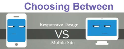
Choosing Between a Responsive Design Vs Mobile Site

Posted by Nikunj Bhanushali
1
Aug 23, 2015
228 Views
Image

A mobile site and a responsive design might optimize your site in order to be more resized with perfection for smaller screens that is both easy for navigation and enables faster loading. A vast majority of individuals access the Internet through smartphones and other mobile gadgets and experience mediocre renderings of web designs, which are originally created for the desktop experience. What happens is when websites are customized for desktop purposes and are viewed in mobile browsers the user does not have a very good experience in such a small display. Therefore, the user has to zoom into the areas that they want to see with more clarity.

Now developing a separate mobile website has become very common. However, the latest challenge is to develop a website with the concept of a responsive web design so that a single website can run smoothly on multiple devices.


Responsive Design Vs Mobile Site

Sr. No.

Responsive Design

Vs.

Mobile Site

1.

The domain can be diluted to hurt organic search traffic. It can also be added to the website management, as you have to maintain two separate silos of content.

Domain Protection

To have a mobile site you must have a different domain. According to Google, to maintain a single shared site gives you a canonical URL, for avoiding complicated redirects that simplifies sharing of web addresses.

2.

A responsive design can be easily embedded into a new code to the back end of your website, where the link equity of your company is preserved, as a better option for search.

Link Equity

A mobile site user has a separate domain. The links can be shared from the mobile browsers and will not be counted as search link equity for your primary site. It is not that good for search.

3.

It is in a responsive design, where the device does the work, for automatically adjusting according to the screen size of the device whether large or small. It keeps switching among these options. It provides a good and flexible solution.

Rendering Experience

A mobile site is normally a copy of your website where the server does the work in order to deliver an optimized page, which is smaller and easier to navigate. This solution allows customization as per the requirement of the mobile users. Although it might be a little too expensive, it is a good and can be redesigned responsively.

4.

It is a better return on your investment. This technology is more forwarding and more rewarding as once added to the site , it will on through the next months and in the next year's the devices do not need to be programmed further.

Future Ready

To rework on a mobile site is important to stay updated with the current smart phones and mobile browsers. However, it requires higher maintenance and expense.


What can be your best choice?

Considering all the factors it is best to have a completely different and distinct web design, exclusively created for the mobile users to view your content with ease. What you can enjoy by going for a flexible mobile web design:

Firstly, a standalone designed mobile websites is typically known to load much faster rather than the any responsive web design solutions.

Secondly, adopting for a mobile website design is usually less expensive than designing a responsive website.

A regular mobile website although gives you the cost benefit factor, ease of development yet a responsive web design gives you more flexibility as well as easy maintenance.

Comments
avatar
Please sign in to add comment.