From Confusion to Clarity: The Art of Designing Wayfinding Signs
In any public space — whether it’s a hospital, shopping mall, corporate office, or university campus — one thing unites visitors: the need to find their way easily. Wayfinding signs are not just functional elements that direct people from point A to point B; they are the silent guides that make navigation effortless, enhance user experience, and even reinforce a brand’s identity. The art of designing effective wayfinding signs lies in turning confusion into clarity through thoughtful design, strategy, and execution.
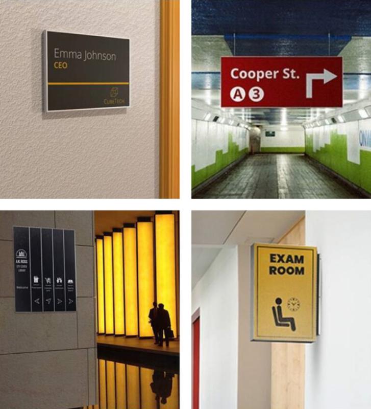
What Are Wayfinding Signs?
Wayfinding signs are visual communication tools that help people navigate complex environments. They include directional signs, identification signs, informational signs, and regulatory signs — all working together to guide visitors seamlessly.
From a “Reception →” arrow in an office building to floor directories in a shopping mall, wayfinding signage helps create a logical path for movement and reduces frustration.
A well-designed wayfinding system does more than direct; it informs, reassures, and enhances the overall impression of a space. When designed poorly, however, it can lead to confusion, inefficiency, and negative experiences for visitors.
Why Wayfinding Signs Matter
-
Improved User Experience
Visitors appreciate spaces where they can find their way without asking for help. Clear wayfinding signs build confidence and reduce stress — especially in large or unfamiliar environments like airports or hospitals. -
Brand Perception and Professionalism
Every sign contributes to how people perceive your organization. Consistent typography, color schemes, and logo placement make the signage system feel like an extension of your brand identity. -
Enhanced Accessibility
Wayfinding is also about inclusivity. Signs that include Braille, tactile letters, contrasting colors, and symbols ensure that everyone — including people with disabilities — can navigate comfortably. -
Operational Efficiency
Clear signage reduces the need for staff assistance, improves traffic flow, and helps visitors reach their destinations faster. This creates a more efficient environment, both for visitors and employees.
The Art and Science Behind Wayfinding Design
Designing wayfinding signs is a balance between creativity and functionality. It’s both an art form and a strategic communication process. Here’s how to do it right:
1. Understand the Space
Before creating any design, a thorough understanding of the environment is crucial. Designers must walk through the space as a first-time visitor would — identifying key decision points, entrances, exits, and areas of confusion.
This stage often involves site surveys, mapping, and spatial analysis to understand how people move and where they need guidance most.
2. Create a Hierarchy of Information
Not every sign needs to say everything. A successful system prioritizes what users need to know at that specific point.
For instance, at an entrance, you might only need a main directory; in a hallway, a directional arrow is sufficient. Too much information can overwhelm — clarity comes from simplicity.
3. Focus on Readability and Legibility
A beautiful sign is useless if people can’t read it quickly. Choose clear fonts, ensure high color contrast, and maintain adequate text size depending on viewing distance.
Sans-serif fonts, consistent spacing, and non-glare materials make signs easy to read even from afar.
4. Use Universal Symbols and Colors
Symbols transcend language barriers and are essential in public spaces. The right icons — for restrooms, exits, elevators, etc. — allow instant recognition.
Similarly, colors play an important role: blue often indicates information, green points to exits or safe areas, and red signals prohibitions or warnings.
5. Ensure Consistency
Consistency builds trust. Every element — from arrows and icons to typography and background color — should follow a unified design system. This makes navigation intuitive because users subconsciously learn to associate a certain color or shape with a type of message.
6. Integrate Branding
Wayfinding doesn’t have to look plain or purely functional. Adding your brand colors, logo, and visual style subtly across signs can strengthen brand identity while maintaining clarity. Think of it as blending utility with aesthetics.
7. Think About Materials and Placement
The choice of materials should reflect both the environment and brand personality. For instance, brushed metal may suit corporate settings, while colorful acrylics might work better for retail or educational spaces.
Placement is equally important — signs should be at eye level or above pathways, free from obstructions, and visible under various lighting conditions.
Digital and Smart Wayfinding
In today’s tech-driven world, digital wayfinding systems are becoming increasingly popular. Interactive kiosks, touchscreens, and mobile-based navigation apps allow users to search for destinations and get customized directions.
These smart systems can be updated easily and even integrated with real-time data — perfect for large campuses, airports, or hospitals where layouts and departments change frequently.
However, traditional static signs still play an irreplaceable role. The best approach often combines digital and physical wayfinding for a seamless, modern experience.
Common Mistakes to Avoid
-
Cluttered layouts that confuse rather than guide.
-
Inconsistent styles between different areas of a building.
-
Poor contrast or small text, making signs unreadable from a distance.
-
Ignoring accessibility features like tactile lettering or Braille.
-
Improper placement where signs are blocked, too high, or too low.
Avoiding these pitfalls ensures that your signs serve their true purpose — guiding users effortlessly.
Conclusion: Design That Guides, Not Confuses
The art of designing wayfinding signs lies in understanding human behavior and anticipating user needs. It’s not just about arrows and text; it’s about creating a journey that feels natural, intuitive, and stress-free.
Whether you’re designing signs for a hospital, retail complex, or corporate office, focus on clarity, consistency, and visual harmony. When done right, wayfinding signs don’t just point the way — they make people feel welcome, confident, and connected to your brand.
Post Your Ad Here
Comments