The Psychology Of Color Marketing
Some of you may laugh at the title but trust me, I'm deadly serious because you can have the perfect site but if the colors aren't right for sales you might as well have saved your money because certain colors are an automatic turn-off to certain people and cultures.
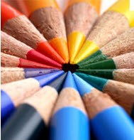
Colors mean different things to different people, when I see certain colors on a site they tell me whether I'm going to stay on the site or click away immediately. Below are a few clues to let you understand what I mean:
1. When I see Earth colors on a site I'm immediately set at ease such as soft Gold, earth colors, greens, not Lime Green something more like Forest or Kelly Green is more calming to me.
2. White is always good, in my last post I told you about White space in your blogs, our brain reacts favorably to white tones.
3. Fire Engine Red is a no-no for a site because our brain is trained to associate Red with Stop or warning signs. Thats the signal the brain immediately picks up and is turned off by.
4. Silver with a Blue mix is perfect selling colors, either alone is fine as well, our brain associates Silver with money and stainless steel, Blue is associated with many things on earth and in the sky including animals.
5. Bright blazing Sun Yellow is another problem because it can be too much of a shock to the optic nerves in our eyes just like deep Red.
6. I almost forgot Orange, soft Orange tones are always good, like the color of a beautiful sunset.
7. Purple has a place in Marketing as well, its not threatening and it can also have a calming effect.
In closing, to test my theory just take a look at the mega brands to see what colors they use. Its no mistake they're using those colors, alone or in tandem. Its a well thought out science just like the shape of product containers.
This is not an exact science because selling colors will differ in different parts of the world, just know your market and selling will be much easier, just take another look at your site and ask others about your color scheme. Its more important than you'll ever know.
Stop by my main site to see Multipures color scheme, you may get some ideas.
http://multipureusa.com/phines


Post Your Ad Here
Comments (7)
Paul Hines16
A New Path to Financial Empowerment
Yes it is, I think so too.
Zhangl Zhangl4
http://www.oneaf.com
yes, I think you are right! It's worth to learn!
Paul Hines16
A New Path to Financial Empowerment
Cool, stay tuned.
Raunaq Rayait6
Search Marketer
Paul frankly speaking i had never thought that even colour can also make difference.Your sharing is very unique and seems very useful.I will definitely implement these concept of Color Marketing.Thanks and keep experimenting.
Paul Hines16
A New Path to Financial Empowerment
Thanks Paula and Sean and you're right Sean when you say if used minimally,it does work.
Paula van Dun16
Retired
For me and many Dutch purple stands for death and funerals. Interesting how colors work in different cultures and countries
Sean North12
Business
great post Paul, I have to disagree about reds though as well as danger they are a very powerful, hot, passionate and motivating colour, and used minimally to highlight impotant parts are a winner,