Significance of colors in mobile app design
Second most thing which is important for your mobile application is considered as its colors. Interaction between human and digital medium basically depends on the UI of apps. More you create an attractive application more you get the attention. Application development doesn’t rely on only the functionality portion. You should have similar focus on design with functionality. Concoction of these two can create something beyond imagination. That’s what everyone want. Design depends on the color combination you use for mobile application development. So now, the question is how can we find the significant color for our Application? isn’t it? Don’t worry for your app. Here, Concetto Labs will help you to make the right choice for your mobile app development.
Choose an eye catching color for your application icon
When you look into play store OR app store, you can find variety in colors for app icon. This is the base, where you can create your impressive image in front of users. Here, you should have to make decision of choosing color that can describe your application through your app icon. Based on the workflow of your app you can make the right decision. The power of your imagination and knowledge comes in this picture.
If you have noticed then Blue is the favourable color for creating a logo. Trending application like facebook, Linkedin, twitter all are created with different shades of blue. Since, blue is quite simple and attractive color so maximum people choose it. You can use different shades of Green as well. It is also a captivating color.
Choose the perfect color during UX/UI designing
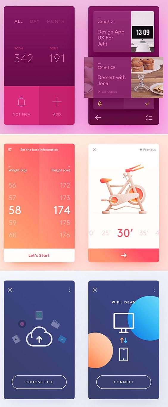
Picking up proper color for logo or application theme is not just the solution. You must have to style those color with application design to make it more lucrative. On participating specific event, color should be coordinate with the action via intense results.
Here, we have listed down every colors with its specific identification for your Mobile Application Development.
Yellow: Good faith and satisfaction comes with this color. It indicates to deliver satisfactory results in terms of proper action.
Blue: As we have mentioned earlier, blue comes with simplicity along with attractiveness. Thus, it can help you to improve the profitability of your business.
Green: It connect your with the nature and quietness. In the UX/UI designing, it is the second most preferable color. After blue, green is the color that can attract numerous users towards your application.
Red: It gives you the invitation of attending specific events. For event based application and the application that convey something related to emergency then you might use Red color.
Purple: If you have unique brand and innovative creation then purple is perfect for you. To design your e-commerce website, you can use purple.
Orange: It shows the energy and excitement towards specific action. It can give leads and motivation to take action for purchase. Also, 9% of application built with orange color which is quiet good.
To sum it up: Design with color is the way to create your application with certain amount of creativity to attract the mass of people. It is something that inspire people to purchase or increase the productivity from your application. Only one thing we need to keep in mind is to take about the engagement of color with design. Give the value addition with the product that can improve the quality.
Post Your Ad Here
Comments