Jewellery Brochure Design tips
Every business needs a brochure to
market their goods and services. A brochure contains design elements to capture
the attention of their intended audience. Brochures entice prospective clients
to probe deeper into the content by reading further about a topic or getting
contact information about the company.
A jewellery brochure proposition is an
elegantly packaged piece of communication that balances on the edge of
contemporary design and bespoke jewellery. A well-designed handbook of
jewellers should contain effective colour contrast, images, and text to
communicate a concise positive message. We have listed a few quick tips below to
ensure your brochure composition is enticing enough to captivate the consumers
and build curiosity to know more about you.
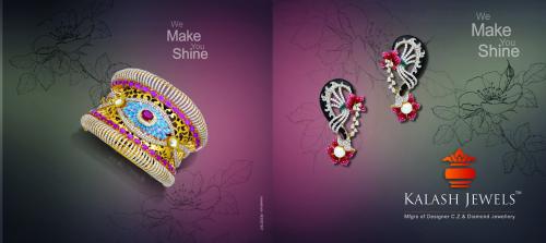
Mix
of Images and Content: A jewellery brochure is intended as teaser of a
product range or a brand. A stylish modish cover with a profile on first page
is just enough to know what your brand is all about. As there is a restriction in
number of pages, further pages can build up a story about a collection or carry
categories. Each product is a piece of an art in itself and hence, a poetic composition
is just perfect to raise the glam quotient.
Colour
Contrast: Unlike any other marketing tool, brochure composition can depict
various colours at a time. The colour scheme depends on the story, products and
the brand colour. The colour contrast has to be maintained effectively so that
it looks a piece of ‘wow’ literature and not disturbing one.
Selection
of Papers: Most printers that print brochures offer an array of papers with
respect to texture and thickness, and a variety of gloss / matte finishes. Over
and above your choice, generally a 100gsm paper-stock is substantial than 80gsm
stock paper without a huge cost difference. Using a heavier paper may convince
a potential customer that you are more professional than your competitors.
Post
Printing Effects: Just like an icing on the cake, a good printer offers a variety of
finishing touch ups to give you a competitive edge. You can choose from matt,
UV, Varnish, Laminate and many more. Adding varnish will add an appealing gloss
to your brochure. And if you have a lot of ink coverage, your brochure will
appear glossy anyway. However, if you use too many dark colours in your brochure design, using a varnish will prevent fingerprint smudges on
your brochure.
Type of Paper and post printing
touch-ups have to be kept in view while designing a brochure.
High
resolution Images: Using high-resolution images in your layout is a
critical step towards creating a professional looking final brochure. Expert jewellery photography focuses on all key elements of the jewellery pieces and
the same should be clear even on print. Hence, we recommend that jewellery images
should be at least 300dpi to print clearly with full sharpness. Images can come out soft, blurry or even
pixilated on printing, if they are not of good quality.
Following these designing tips will
enable you to create an enticing jewellery brochure for your jewellery brand.
It will also help you to pitch the products and services of your brand in a
presentable manner to your clients.
Post Your Ad Here
Comments