 Articles
Four obvious mobile app design mistakes you can start avoiding now
by App My Site DIY App BuilderApp design looks easy on the outside. We are past the stage when a beautiful app design would wow us as consumers.
A look on the inside would show the challenges involved in mobile app design. Every little element of a mobile app, from the user onboarding pages to the home screen and the settings page need top to bottom design optimization. Anything else makes an app look incomplete and buggy.
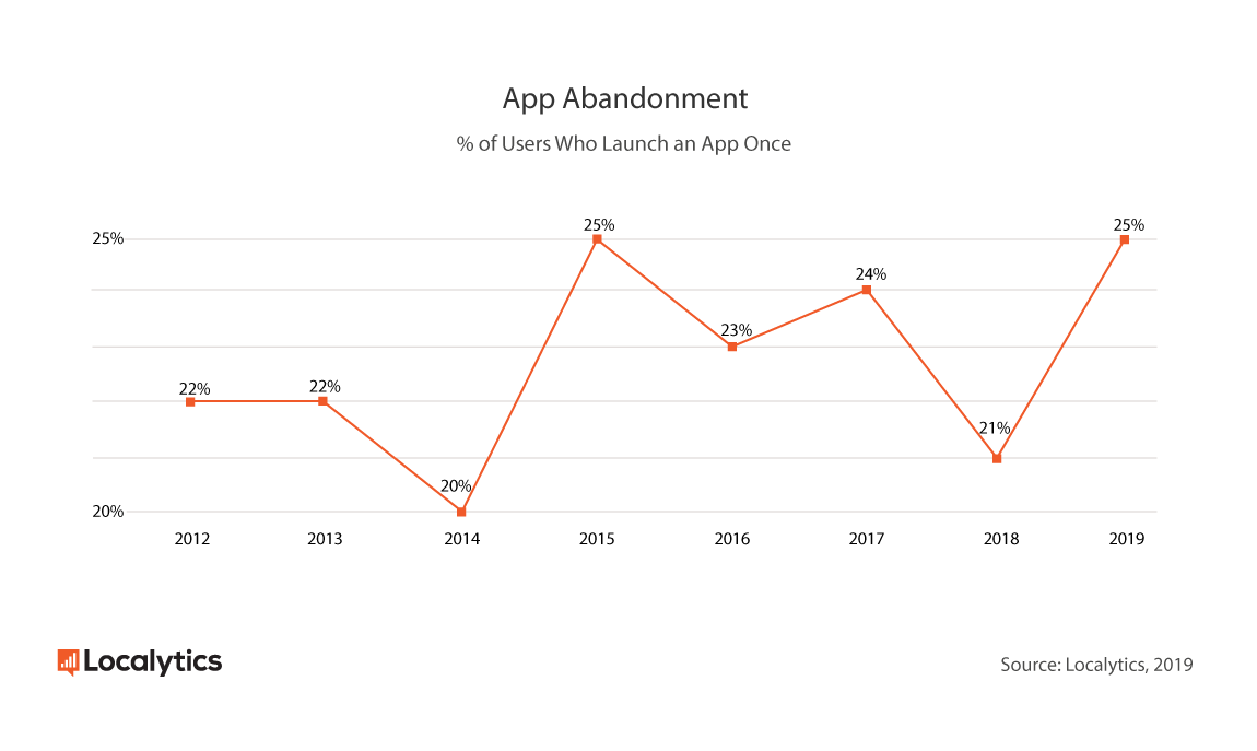
A study a while back showed that 25% users abandon an app after their first use of the app. Such a sudden decision to uninstall or simply leave an app untouched can only happen due to a select few reasons. A bad user experience is high in that list of reasons.
Users have alternatives for most kinds of apps. They generally don’t compromise and reject their own bad experience while using an app. This makes the jobs of UX designers even more challenging. They cannot afford to make little mistakes that make user experience worse.
Let’s take an example. Assume you have an ecommerce website and decide to bring an app to market. You don’t know how to code and so you use a mobile app builder to convert WooCommerce site to mobile app.
In case the experience of using your app is lacking in some way, your customers can simply jump to another app. There is no shortage of ecommerce apps in the market. Thus, it is imperative for those with an app in the market to get the design right.
This piece covers four obvious mistakes UX professionals can avoid while working on mobile app design.
Ignoring the primary function of an app
Some screens of your app will naturally have more visitors than others. This is true for both big and small apps.
Every application has a primary function. On Netflix, the primary function of an app is to guide people to the content they want to watch. On a blogging app you built with the help of an online app builder, the main function is guiding people to the blog post.
A successful app has to first perform its primary function well. Netflix cannot prosper if its video player is faulty or its content discovery system is slow and unengaging. Your blogging app will lose users without an optimal screen to read the content on.
One common mistake designers make is not optimizing the primary function of the app. This mistake emanates from a lack of knowledge of the true primary function of an app.
It is impossible to optimize every little part of an app for an ideal user experience. The best UX designers can do is to turn their focus on optimizing the primary function of their apps.
This can mean enabling simplified mobile navigation with direct access to main screens from the home screen. Other optimizations are also possible with the right application of key design principles.
Use of unfamiliar terminology
More than a decade after using smartphones, most users around the world are familiar with a certain set of app terminology.
For example, users know the meaning of terms like ‘Home’ and ‘Explore’. Popular apps leverage this basic knowledge of users to name the important parts of their app.
However, new apps coming to market do experiment with different terminology. This is partly driven from an urge to stand out in the market. Basic terminology like ‘Home’ and ‘Account Settings’ are ignored for some other eclectic options.
Is this a good idea? One thing no new app can afford doing is confusing incoming users. Even if an app is providing something new and different, it must occupy a vessel most users are familiar with. This means using terminology and a basic design layout users are familiar with.
Unfamiliar terminology can strike confusion in the minds of new users. It goes against a very simple principle of design - making things easy for users.
The best option for companies bringing an app to market is using familiar terminology for app sections as well as important CTA buttons.
Lack of focus on user onboarding
Let’s take an example. Assume you have a travel blog and decide to launch an app to reach more mobile users. You don’t know coding and thus use an online app creator to turn WordPress website to Android app.
It’s naturally difficult to convince people to download an app only to read travel blog posts. Despite the difficulty, you do manage to get a few people to download your app.
What is the first thing your users will see on opening your app? They’re likely to first see the log-in and sign-up screens.
Users generally don’t remember a lot about the user-onboarding process. This is partly because they’re not supposed to. An ideal user-onboarding session guides a user into an app uneventfully.
Also read: How to design an ideal app dashboard?
The option to enable social log-in through platforms like Google and Facebook make the process even easier.
A common mistake companies make is not working enough on the user-onboarding screens. 72% of users consider completing user onboarding within one minute an important factor while deciding whether to keep an app or not. This only underlines the need for making user-onboarding a priority for enhancing user experience and regulating app abandonment.
Half-baked testing process
App testing is a crucial vertical is a typical app’s journey. Even a simple app with a small number of screens and sections can have many obvious bugs and design flaws. The testing process essentially helps reduce these bugs.
There are various types of app testing procedures companies generally follow. The overall goal is to find any issues that may later impact user experience.
We discussed three obvious design mistakes earlier. A good testing process will alert designers to all these three mistakes.
How does app testing generally happen? There are different methods companies employ to test an app. The first step is to test the app on a live emulator. This helps companies get a basic understanding of the layout of their apps.
The next obvious step is testing the app build on a real mobile device. This helps companies study the performance of apps on different mobile devices in a variety of conditions. For instance, companies can test how an app performs under a slow internet connection or a less than optimal screen resolution.
A half-baked testing process basically refers to situations where companies don’t test their apps thoroughly. Bringing a buggy app to market has a big impact on an app’s perception and ability to scale. It is thus vital to have a comprehensive app testing strategy.
In conclusion
Making mistakes during app design is normal. The scale of the task invites errors on the part of designers. The best professionals can really do is learn from their mistakes and work towards a better app design.
Sponsor Ads
Created on Oct 19th 2020 04:45. Viewed 801 times.

