 Articles
10 Logo Design Tips & Tricks for Brands to Stand Out
by jignesh kakadiya Be Happy to Be HappyA Logo Design might be small but it carries the entire Brand identity on its shoulders. They may make graphic designers or individuals scribble a hundred ideas. But once completed successfully, they become an irreplaceable identity of your brand.
The usage of the logo is now not limited to a business card, shopping bag or product stickers. With the availability of Logo Maker Online, logos are now being designed creatively & deployed online & offline tactfully. This becomes a key point for any designer to consider the usage of the logo while designing it so that it looks as beautiful in the social media post as it seems on billboards.
Any amateur logo designer (and even professionals) have to start from scratch every time while making a logo design. Don’t worry if you’re starting a new one or refreshing an existing one, we’re here with an ultimate guide for you to end-up feeling good.
Here’s your cup of motivation, go on…
How to make a logo that’s attention-grabbing?
‘We built an Empire in a Day’ – said no one ever! It’s a great amount of research work to design a logo that’s eye-catchy and spellbinding. The more you plan, the more you’ll be organized.
If you’re stuck at “How to make a logo?”, here are the qualities to expect when you finish the process:
- It should be Eye-Catchy
- It should be Timeless
- Easy to remember or memorize
- Looks even whether used as Enlarged or Small
- Gives Positive Thoughts for the Brand
A logo should be designed in harmony with the brand to be iconic. Someone looking at the logo should instantly feel like ‘They can be trusted’ or ‘the brand seems genuine’.
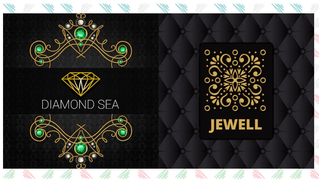
For instance, when you design your own logo as a jewelry maker, one must always get vibes of shopping from a classic jewelry store. A feeling of richness, trust, and authority should arise. It must be parallel to the type of jewelry crafted by the said brand.
Once the brand vibes are clear and understood, the logo designing process can literally get 10x easier (create your own logo and you can experience it).
Before you scroll down to the Logo Design Guidelines, get ready by penning down at least five to ten words that represent the brand. This will be very helpful in making the picture crystal clear.
10 Best Logo Design Tips & Tricks
Here are the ten best logo design tips & tricks from experts that’ll blow your mind:
1. Understand your business first
Before starting with a handy Online Logo Maker that has tonnes of graphics and wonderful features, you need to do some serious brainstorming.
The following details should be on hand:
- What’s the core idea of the brand?
- Which element can represent the brand at its best?
- Who is the target audience of the business?
- What does the brand aim for in the future?
- Is the brand rough & tough or represents a softer tone?
These are the basic ingredients for a logo recipe that MUST be worked out before hasting to complete logo designing as soon as possible.
2. Use Visual Puns for Unique Hints
Who says a simple logo can’t be creative? You can get the best out of a logo maker and logo creator by adding a visual pun. You’ll enjoy the way logo personalization can be achieved by adding quirkiness to any element. But don’t forget what we discussed above – it should be in harmony with your brand.
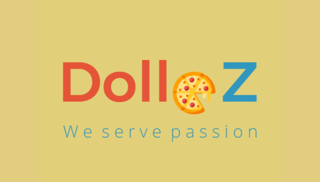
In the above instance, you can see that a pizza slice is missing and it still represents the letter ‘O’ brilliantly. This is what we call as Visual Pun. You need a creative mind and logical thinking at the same time to implement this idea.
Getting experimental is good but it works only when it’s logical. For instance, you cannot implement it for any food item. What looks good for a pizza might not fork for ice cream or sizzler – remember this!
Just be careful and go on!
3. Remember “Simplicity always Rules”
It’s a good idea to give your inputs for making the logo look better but the golden rule is “SIMPLICITY ALWAYS RULES”. You can refer to the logo design of top brands and figure out that they may not have made any extra efforts. The smart use of empty spaces, excellent placement of initials & sometimes Black & White combination is the Remember “Simplicity always Rules”
old-fashioned & timeless style.
Do you know? Blank spaces are used in the logo because it triggers the emotion of calmness.
If you think that your brand matches this idea, give it a try. You can take minimalism to the next level by applying this concept.
4. Decide if you want to stay IN or OUT of the box
What people usually do is either they’ll put up things (text & graphic) within a box or will separate them by differently arranging the graphic & text. How would you like to do it? For a better understanding, you should try doing it both ways and keep what looks better.
To be precise, when you’ll use the “INSIDE THE BOX” concept, it looks neat and professional. With the “OUTSIDE THE BOX” concept, you have the choice of utilizing the graphic alone too.
5. Consider Usage – Where will it be seen more?
As mentioned above, a logo is not only utilized for letterheads or business cards now. You may have it as a website icon, favicon, like Facebook & Instagram profile picture, a watermark in social media posts, and so on.
No matter if you use online logo maker, keep in mind that it is created after stressing on “Where it is going to be seen more?”, “Will it look good equally as your website icon?”, and “Is it easily identifiable as a favicon?”.
6. Create a Logo that evokes Trust
What the end-users will think of your brand at first sight? Will you trust it if you look at it with the target user’s perspective? A hidden intense seriousness should be present in at least one element of your logo. Nail your logo by experimenting with all the possibilities that make it an authentic and non-boring. Use fonts and graphics very carefully.

7. Visual Salience is Outstanding
We’ve been learning all the time to be picky with colors but your logo can have that one element stealing the show. A hint of color can make a difference and draw attention.
“Visual Salience is an Art born out of a curative thinker’s mind”
Do you remember Amazon’s logo? A yellow-pop arrow from A to Z serves special meaning.
But, the rest of the elements should be unicolor if you intend to apply this theory else there will be different colors already existing in the logo and the ‘pop’ will be overshadowed.
8. Competitive Analysis plays a vital role
Sometimes, you should go with the flow for a better understanding of the logo. For instance, a bakery business can better be represented with elements like “Wheat”, “Established since the year”, “a baker’s face”, “baker’s hat”, etc. Reinventing the wheel can be a bad idea here as customers may not understand the business.
This does not mean that you should follow the trend, only the theme should be followed & the usage of elements is in your hands.
9. The Impact of Colors in Logo Design
The basic idea for choosing a logo color is mostly black & white but, subtlety can also be created by using different shades of the same color. Monochromic effects look enthralling and this is not what we say but you can see it…
10. Never be afraid to Juggle Up
Your brand may be existing for more than a decade or even a century. There is an inner desire to redesign the logo when you come across some Best Logo Maker. As there is an image of your logo in people’s minds already, one needs to be very conscious. A time-traveled logo changing suddenly may take time for people to grasp and replace the existing logo image.
The logo may have text and icon or it sticks to some color combination. You need to identify the basics – what must not be changed, no matter what.
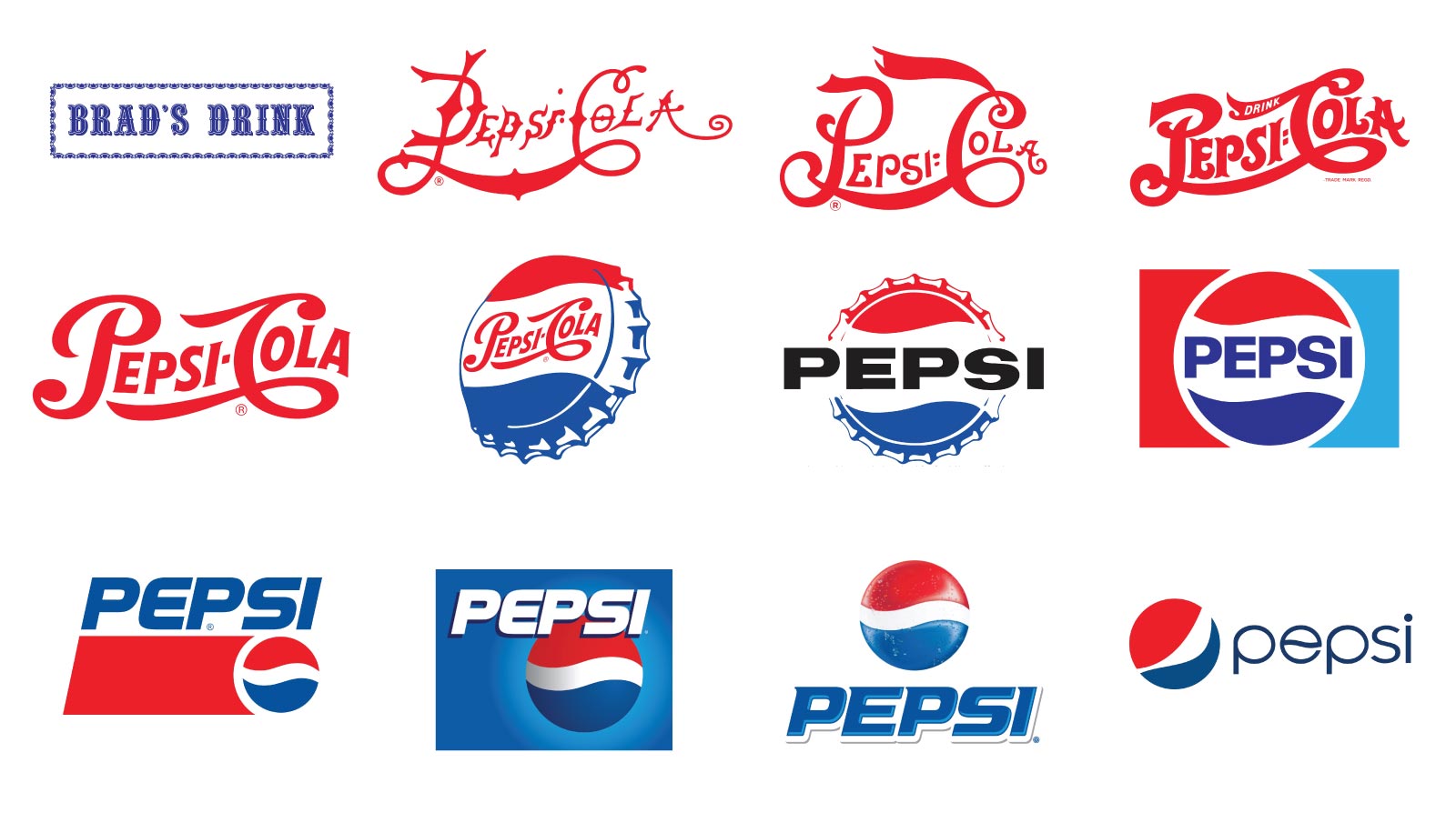
You should only enhance the logo and don’t change its meaning. The best example is PepsiCo. Its logo has changed numerous times yet the red-white-blue ball has remained iconic.
Takeaway
I hope you’ve got some of the best tips for creating a logo here. Please note that logo designing is a vast concept and besides the availability of create logo online, one needs to have a better understanding of the dos and don’ts to make it a success! These 10 critical ideas will guide you to make your way through with confidence.
Sponsor Ads
Created on Dec 14th 2019 03:59. Viewed 641 times.

